
Stappa: Brand Identity
Feb 2023
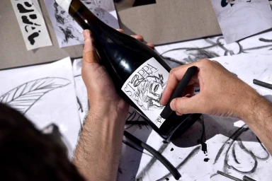
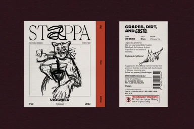
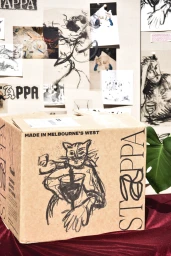
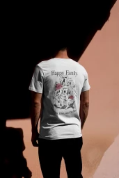
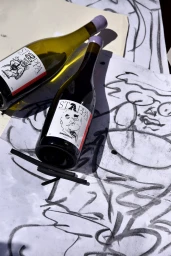
Studio Chenchen developed the brand identity for Stappa, an alcoholic beverage line defined by its raw, illustrative approach to packaging design. The project centers on a monochrome aesthetic that utilizes hand-drawn ink sketches, charcoal textures, and expressive typography to establish a tactile brand presence across a range of wine varietals. The visual system leans into a minimalist, artisan-led narrative, often documenting the creative process through live-action footage of sketches and ink-on-paper drafts. By pairing bold, clean design with whimsical character illustrations—ranging from animals to stylized figures—the identity balances a sophisticated graphic sensibility with a playful, approachable tone. The resulting packaging and collateral emphasize the maker's hand, utilizing natural light and high-contrast composition to highlight the materiality of the labels.
Horizontal, Commercial, Clean
Ink
