
Shinko: Brand Identity
Feb 2022
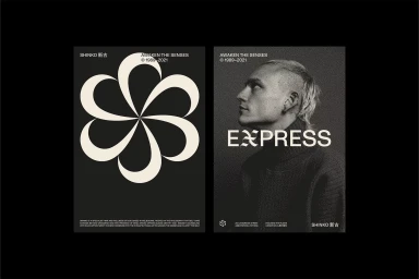
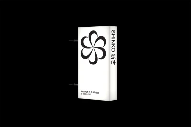
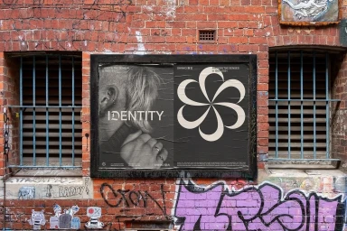
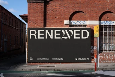
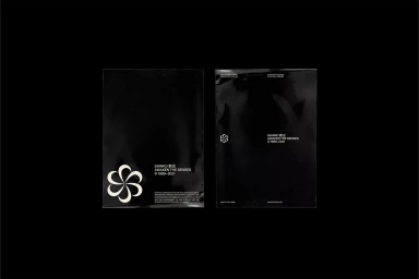
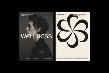
Shinko’s brand identity project, designed by Geoffrey Taylor, establishes a cohesive visual language built on high-contrast monochrome tones and clean, minimalist typography. The system centers on a stylized geometric floral emblem, rendered with vector precision in both static applications and smooth digital animation. The project translates this identity across a range of media, from sleek packaging and internal signage to large-scale urban billboard installations. By balancing stark, minimalist graphic motifs with grainy, editorial-style photographic portraiture, the work adopts an aesthetic that blends corporate precision with urban textures. These elements are unified through a consistent use of bold Latin and Japanese characters, grounding the brand’s visual expression in a clean, sophisticated design framework.
Horizontal, Commercial, Clean, Minimalist
Typography
Advertising Campaign
