
Brand
ProjectBrand Identity
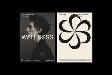
Shinko Brand Identity 2022
Associated creatives

Tags
Description
This graphic design project by Geoffrey Taylor for the brand Shinko showcases a brand identity layout across two contrasting presentation panels. The left panel features a heavily grained, dark monochrome side-profile portrait of a young man with typography reading WELLNESS and SHINKO. The right panel displays a bold, symmetrical black floral or windmill-like geometric emblem set against a light background with accompanying brand copy. The composition employs a refined editorial aesthetic with high-contrast monochrome tones and sophisticated typography.