
Seal+Co: Brand Identity




Oct 2020
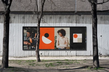
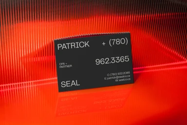
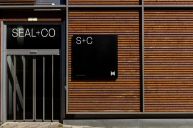
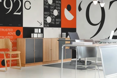
The new brand identity for Seal+Co marks a decisive pivot toward a sophisticated, human-centric corporate aesthetic that balances professional rigor with genuine warmth. Developed with precise graphic design by CUSP, the visual system moves away from sterile institutional tropes, opting instead for a vibrant, high-contrast palette of black, white, and orange that feels both contemporary and grounded. Central to this project is a lifestyle-driven approach that prioritizes inclusivity and clarity, as evidenced by the high-quality commercial photography integrated throughout the identity. By pairing clean, minimalist typography with tactile elements like kraft paper stationery and Polaroid-style imagery, the design team effectively anchors the brand in a space that feels personal yet authoritative. The inclusion of thematic infographics and sharp, modern office interiors creates a cohesive narrative that speaks to the firm’s history while signaling a forward-thinking mission. Utilizing soft light and clean compositions, the work successfully transforms standard corporate collateral into a tangible, memorable brand experience. With meticulous attention to detail provided through THE MOCKUPS, every touchpoint reinforces a sense of intentionality, demonstrating how subtle adjustments in layout and material choice can elevate a service-based identity into a distinct, high-impact presence in a crowded market. This identity ultimately thrives by bridging the gap between functional accounting requirements and a modern, approachable aesthetic.
Horizontal, Commercial, Clean
