
Rise: Brand Identity
Oct 2018
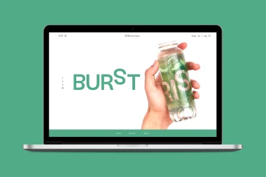
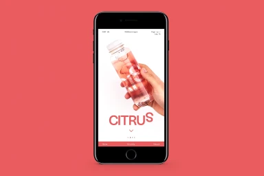
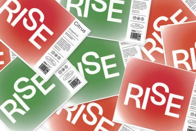
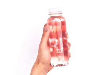
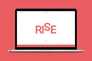
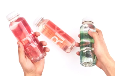
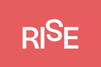
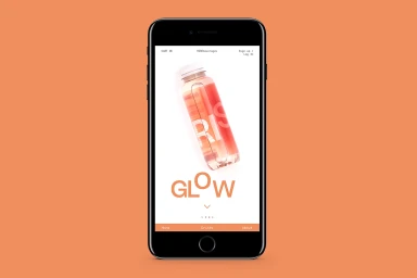
The brand identity for Rise, a burgeoning player in the CPG and food and beverage sector, represents a masterclass in modern digital storytelling and product-centric design. Orchestrated by graphic designer Curtis Rayment, the project achieves a sophisticated, cohesive aesthetic that bridges the gap between physical retail packaging and a seamless e-commerce experience. The visual language relies heavily on editorial minimalism, utilizing an expansive use of negative space and a refined, muted color palette that allows the products themselves to serve as the primary focus. High-key lighting techniques and natural light treatments emphasize the liquid clarity of the beverage line, resulting in imagery that feels both sterile and invitingly fresh. The digital execution is equally deliberate, featuring a clean UI illustration style characterized by modern, sans-serif typography that reinforces the brand's identity across web and mobile interfaces. Throughout the assets, the focus remains on brand clarity, with bold wordmarks and gradient-driven packaging labels creating a rhythmic, professional presence. By stripping away extraneous noise, the design elevates the simple act of product interaction, ensuring that every touchpoint—from the mobile checkout flow to the tactical layout of nutritional infographics—feels intentional, premium, and inherently scalable within a competitive market. The result is a brand that feels both approachable and distinctively contemporary, setting a high bar for visual standards in the beverage industry.
Commercial, Clean
Solid Colour
