- Home
- ·Projects
- ·Reasoning Project
- ·2026
- ·Brand Identity
Reasoning Project Brand Identity 2026
About
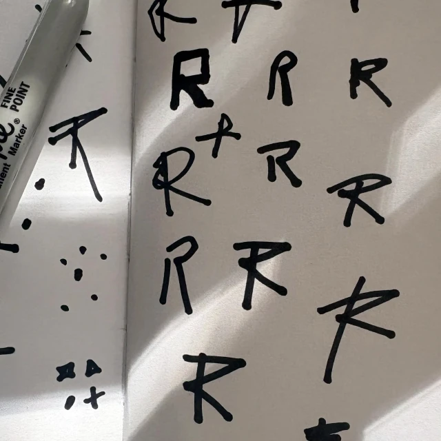
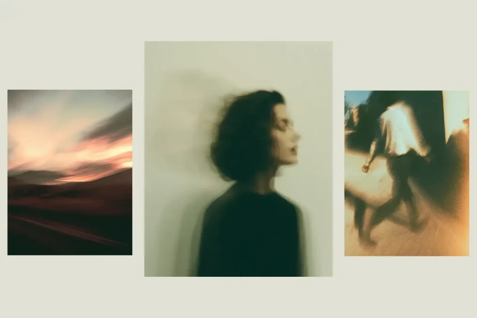
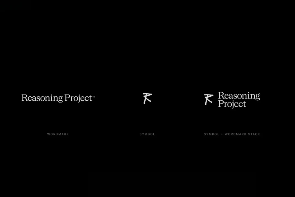
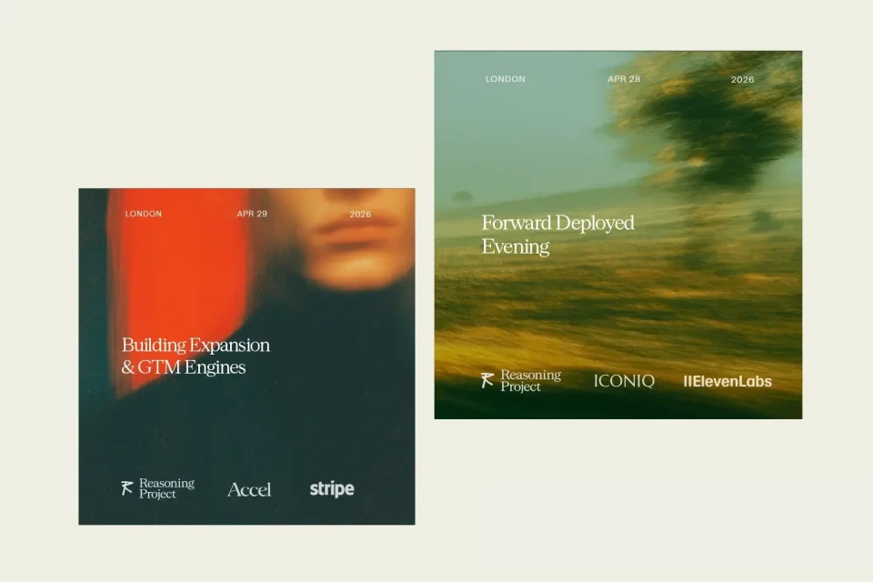
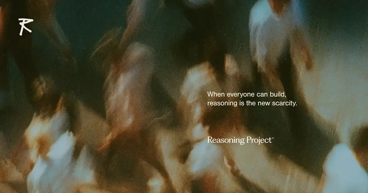
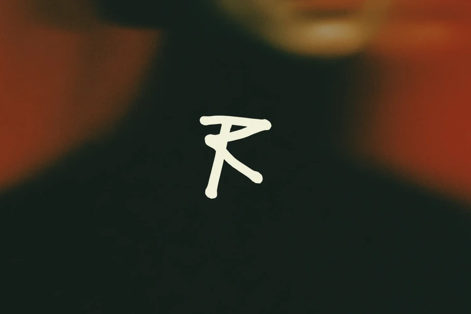
The Reasoning Project brand identity project serves as a masterclass in modern corporate storytelling, skillfully bridging the gap between high-concept abstract art and functional commercial design. Through a sophisticated visual language, the project leans into editorial minimalism to frame the brand's core mission: exploring the scarcity of human reasoning in an era of rapid technological advancement. The identity is defined by a striking contrast between raw, conceptual sketching—seen in the candid documentation of hand-drawn iterations—and polished, high-contrast serif typography. By integrating cinematic motion blur and live-action techniques, the design language moves beyond static graphics to convey a sense of kinetic energy and forward momentum. This is particularly evident in the triptych compositions and digital graphics that pair abstract, out-of-focus subjects with precise, clean lettering. With creative vision provided by Under After, the identity effectively utilizes a dark, moody color palette punctuated by vibrant, warm accents to maintain a professional yet evocative atmosphere. By employing UI illustration and intentional, dreamlike slow motion, the work feels both grounded and aspirational. Ultimately, the Reasoning Project succeeds by balancing functional typography with an impressionistic aesthetic, proving that even the most complex corporate narratives can be distilled into a cohesive, memorable identity that resonates with clarity and purpose within the contemporary tech landscape.