
Ready to Die: Brand Identity
Jun 2018
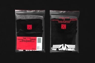
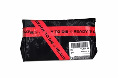
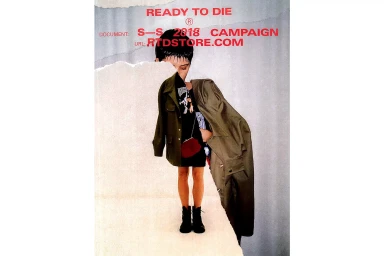
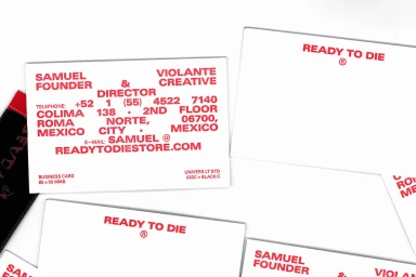
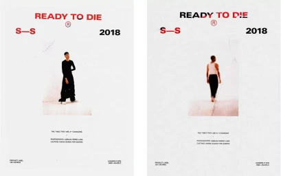
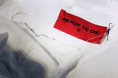
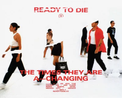
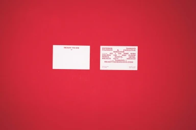
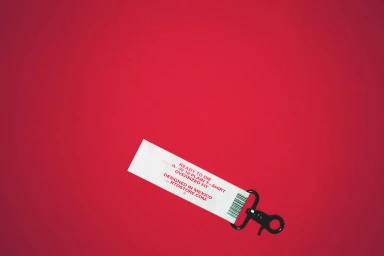
The brand identity for Ready to Die presents a masterclass in minimalist editorial design, blending industrial utility with a refined graphic sensibility. Spanning the label systems, retail packaging, and campaign photography, the visual language utilizes a strict, high-contrast palette of black, white, and vivid red to establish an unmistakable presence. With creative direction spearheaded by Monumento, the identity leans into a modular, technical aesthetic that feels both raw and highly curated. The project effectively bridges the gap between commercial product presentation and artistic expression, employing techniques like collage and torn-paper effects to elevate seasonal campaign materials. Throughout the collection of assets, the use of bold, sans-serif typography acts as the primary anchor, reinforcing the brand's direct and unapologetic tone. Whether capturing the fine texture of a woven fabric label in a macro shot or layering live-action portraiture over stark, high-key backgrounds, the work maintains a rigorous attention to detail. This systematic approach to corporate branding ensures that every touchpoint, from simple business cards to industrial shipping parcels, feels like a cohesive part of a larger, deliberate narrative. By prioritizing negative space and clean, studio-lit compositions, the project successfully transforms standard garment details into compelling editorial statements, solidifying Ready to Die as a brand that treats its internal architecture with as much creative intention as its final product.
Horizontal, Commercial, Clean, Minimalist
Typography
Advertising Campaign
