
Peana: Brand Identity
Sep 2018
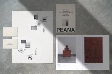
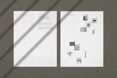
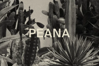
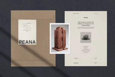
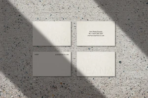
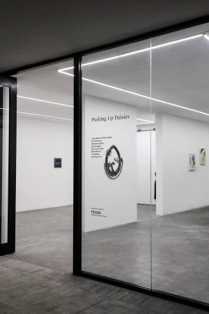
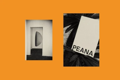
The brand identity for Peana stands as a masterclass in editorial minimalism, weaving together the worlds of corporate rigor and artistic expression within the digital media and entertainment sector. Conceived by the design team at Monumento, the project manifests as a cohesive visual system that prioritizes typographic clarity and structural balance. By utilizing a restrained palette and leveraging the interplay of light and shadow, the identity feels both academic and deeply tactile. The collateral—ranging from embossed business cards on speckled terrazzo to certificates of authenticity and curated posters—channels a sense of permanence and sophisticated institutional weight. Each asset is framed with a commitment to negative space, utilizing hard light and diagonal shadows to emphasize the architectural nature of the brand’s positioning. Whether through the clean, serif typography layered against dense, low-key botanical imagery or the sleek, structural layout of exhibition floor plans, the identity remains consistently elevated. The project effectively bridges the gap between commercial corporate presence and the organic, artistic reality of its gallery space. Through this synthesis of form and surface, Monumento has created a language that feels both precise and remarkably human, ensuring that every touchpoint, from the grain of the print to the physical layout of the gallery, communicates a singular, refined aesthetic vision.
Horizontal, Clean, Minimalist
Typography
Advertising Campaign
