
re-publica: Brand Identity


Jun 2019
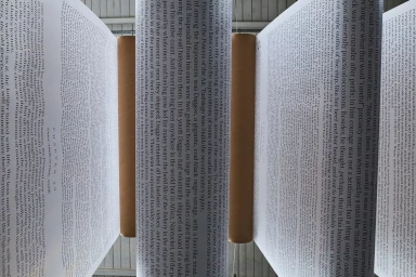
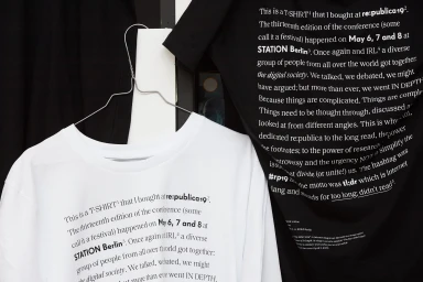
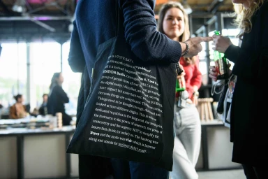
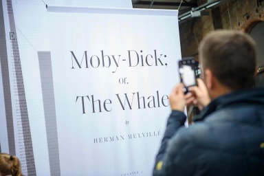
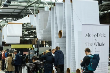
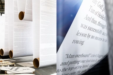
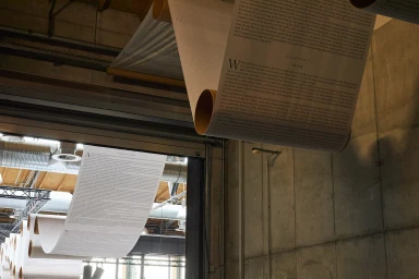
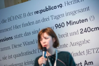
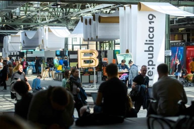
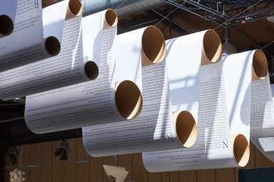
For the re:publica 19 conference, the visual identity system transcends traditional event branding by blending intellectual depth with immersive architectural design. Developed with meticulous attention to detail by Fertig Design, the project leans into a stark, typographic-forward aesthetic that mirrors the event's commitment to digital society and research. The identity is anchored by a dense, academic use of serif and sans-serif typefaces, applied across a wide range of touchpoints—from wearable merchandise like screen-printed t-shirts and tote bags to large-scale exhibition banners. A standout feature of the branding is the grand literary installation, where voluminous paper scrolls printed with passages from Moby-Dick hang from the industrial rafters of STATION Berlin. These scrolls, balanced by cylindrical cardboard weights, act as both sculptural decor and directional signage, softening the raw, utilitarian environment of the venue with rhythmic, organic curves. The execution relies heavily on natural light and soft light techniques to emphasize the monochromatic contrast between crisp white paper and bold black ink. By integrating live-action techniques and documentary-style photography, the branding captures a fluid dialogue between academic content and the vibrant, bustling atmosphere of the conference. This project successfully establishes a cohesive, contemporary visual language that feels as much like an artistic exhibition as it does a professional media and entertainment event.
Clean, Horizontal
Natural light
