
RE: Brand Identity

Brand
Date
Jun 2024
Description
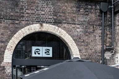
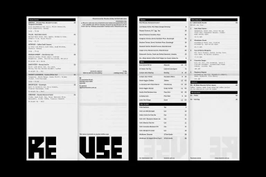
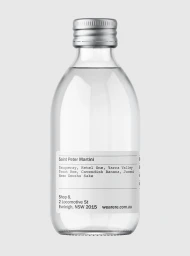
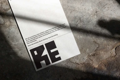
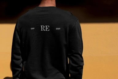
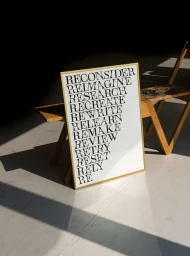
RE establishes a cohesive brand identity through a series of graphic design and environmental assets. The project centers on clean, minimalist typography, utilizing high-contrast layouts for both digital interfaces and printed collateral. Across the brand identity, industrial textures and natural light play key roles in framing the visual language. Led by Visie Admin, the work spans a variety of touchpoints, from menu layouts to apparel design. Standard Projects provided the graphic design expertise, ensuring a consistent application of the brand's aesthetic. The execution leans into a raw, commercial style, balancing bold sans-serif lettering with a restrained, monochromatic palette.
Style
Horizontal, Commercial, Clean
Color
Jet Black
Pure White
Associated creatives

5000+ creatives to discover
Sign up to gain access to the entire directory. It’s free.
Visie is a curated library of creative professionals.