
Microdot: Brand Identity


Dec 2025
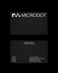
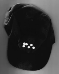
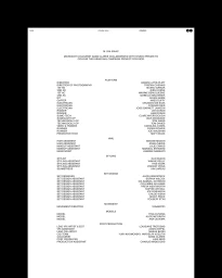
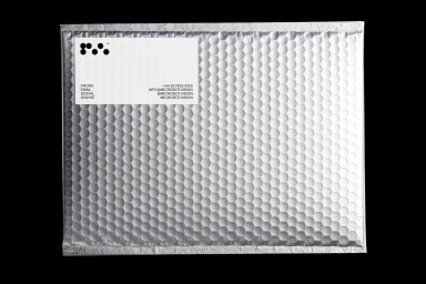
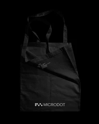
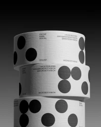
Microdot’s brand identity project establishes a refined visual language grounded in minimalist graphic design. The system centers on a distinct circular dot motif, deployed with high-contrast monochrome applications across digital and physical touchpoints. Developed under the direction of Visie Admin with graphic design by Standard Projects, the work spans diverse formats including motion graphics, print collateral, and product applications. From business cards and packaging rolls to custom merchandise like canvas totes and caps, the project utilizes clean, sans-serif typography to maintain a cohesive, modern aesthetic. Techniques such as motion-based branding and editorial layouts are integrated throughout the identity suite. The execution emphasizes legibility and structured alignment, ensuring a balanced corporate design system that maintains clarity across varied commercial assets.
Minimalist, Vertical, Clean
