
QT Hotels: Brand Identity



Nov 2025
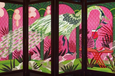
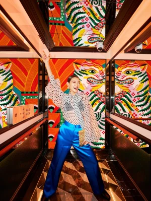
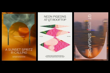
The brand identity project for QT Hotels establishes a maximalist visual language across the hospitality group's portfolio. Developed by Houston Group, the creative suite leans into an eclectic aesthetic that integrates saturated colors, bold typography, and intricate vector illustrations. Collaborative efforts from illustrator Jill Tran and motion designer Nathan Wren bring the brand to life through dynamic motion graphics and artistic, detail-heavy patterns that adorn hotel interiors and digital touchpoints. Techniques such as kinetic type and motion-driven transitions define the brand’s digital presence, framing hotel experiences within a modern, graphic layout. The identity balances clean, minimalist interface design with vivid, playful imagery to maintain a consistent aesthetic across diverse physical and online environments. This comprehensive system encompasses everything from custom illustrative signage and printed collateral to the animated web interface, ensuring a cohesive hospitality experience.
Commercial, Vertical


