
Propely: Brand Identity
Apr 2022
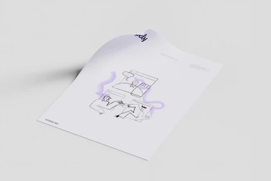
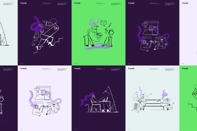
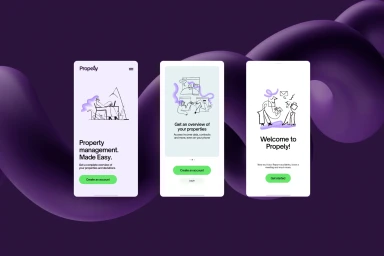
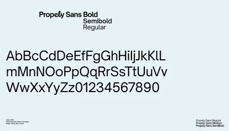
Propely has debuted a sophisticated brand identity that effectively bridges the gap between functional property management software and human-centric digital collaboration. Through a meticulously curated visual language, the project leans into a minimalist aesthetic, characterized by clean, expressive black line-art illustrations that capture the nuances of modern remote work and office life. Designed with the expertise of Uppercase on graphic design and brought to life through the distinct creative vision of illustrator Catherine Potvin, the identity utilizes abstract purple and lime green brush-stroke motifs to inject personality into an otherwise corporate environment. The technical execution is as sharp as the creative concept, highlighted by the bespoke Propely Sans typeface—a modern grotesque family that anchors the interface design across various mobile platforms. By balancing high-contrast vector UI illustration with a professional, tech-oriented color palette, the brand manages to feel both accessible and authoritative. Each asset, from the comprehensive type specimen sheets to the intuitive smartphone application screens, demonstrates a commitment to cohesive storytelling that elevates the brand above standard corporate design. Ultimately, this body of work succeeds by grounding complex digital tools in a warm, artistic framework, proving that commercial branding can maintain a rigorous standard of utility while still offering a distinct, memorable aesthetic that resonates with today’s digital-first audiences.
Horizontal, Minimalist, Clean

