
Omidyar Network: Brand Identity
Aug 2025
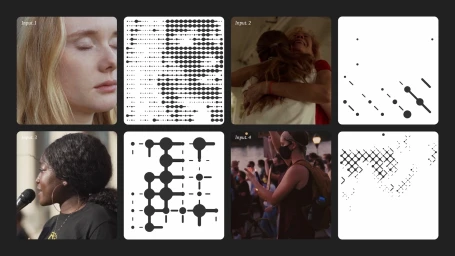
Omidyar Network’s comprehensive brand identity project, designed by 20(SOMETHING), establishes a cohesive visual language centered on minimalist graphic design and technical precision. The system integrates complex motion graphics with structured typography, employing a recurring motif of connected nodes, halftone dots, and geometric lattices that reflect the organization’s tech-focused objectives. The project spans a wide range of applications, from digital user interfaces and data visualization infographics to physical collateral and outdoor advertising. By utilizing a flexible color palette and modular grid systems, the design effectively scales across varied formats, maintaining a polished, consistent aesthetic throughout event signage, stage backdrops, and corporate communications. Throughout the various motion sequences and print assets, the work emphasizes structural form and dynamic transformations. The project utilizes techniques including 3D render / CGI, data visualisation, and vector-style illustrations to articulate a distinct, minimalist brand system.
Horizontal, Commercial, Clean, Minimalist
Motion Graphics
Brand Film / Corporate Video
