
Makosch: Brand Identity

Aug 2025
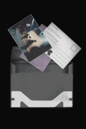
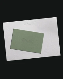
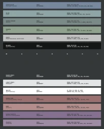
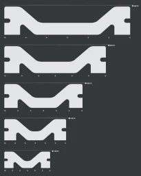
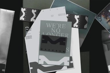
The brand identity for Makosch, developed by graphic design studio 20(SOMETHING), establishes a comprehensive visual language defined by minimalism and structural precision. The system centres on a debossed letterform logo, complemented by a muted, sophisticated colour palette of sage green, dusty purple, and varied greys, which are applied across an extensive suite of corporate stationery and digital assets. Applying a clean, typographic-led approach, the identity moves beyond static print to incorporate fluid motion graphics and web architecture. The project utilizes vector-based geometric layouts and dynamic animation to display financial data and logotype transitions, ensuring scalability and consistency across both printed stationery and digital interface design.
Clean, Minimalist, Horizontal, Commercial
Typography
Brand Film / Corporate Video
