
Ob’edinenie: Brand Identity



May 2020
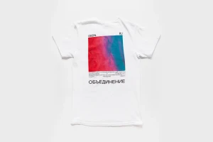
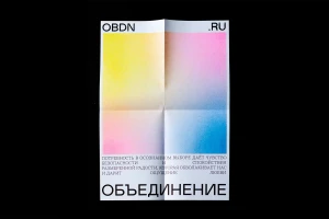
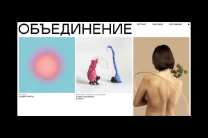
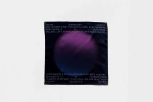
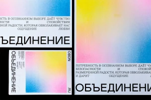
The brand identity for Ob’edinenie, spearheaded by Moscow Mule, is a masterclass in modern, minimalist communication that bridges the gap between digital interface design and tactile physical collateral. By utilizing a sophisticated palette of soft, airbrushed gradients and sharp, heavy sans-serif typography, the project establishes a cohesive aesthetic that feels both futuristic and grounded. The visual language leans into a clean grid system, expertly balancing the intensity of deep black backgrounds with the ethereal light of cyan, pink, and yellow hues. Through a series of carefully curated commercial assets—ranging from sleek, holographic-foiled tech accessories to elegant, matte silk scarves and transparent acrylic hardware—the design maintains a highly structured yet fluid presence. The work integrates artistic collage and vector techniques to define a brand identity that thrives on the tension between organic forms and rigid, corporate-ready UI illustration. Every element, whether a flat-lay photography composition or a digital web interface, speaks to a refined approach where negative space and Cyrillic type are treated with equal importance. This comprehensive system not only provides the brand with a recognizable visual pulse but also demonstrates an elevated level of precision, ensuring that every touchpoint feels deliberate, luxurious, and perfectly aligned with a contemporary, forward-thinking market sensibility.
Horizontal, Commercial, Clean, Minimalist
Typography
