
End of Summer Festival
Brand Identity
Apr 2021
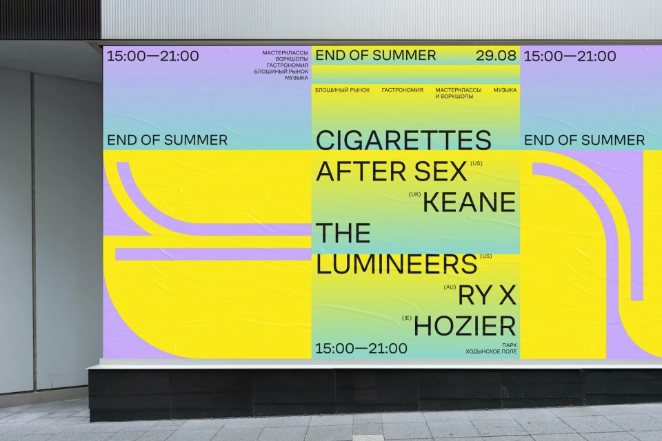
End of Summer Festival presents a vibrant brand identity system designed to anchor its event presence across digital and physical touchpoints. The visual language, executed with graphic design by Moscow Mule and directed by Visie Admin, employs bold, rounded typography paired with a high-contrast color palette of pink, turquoise, yellow, and lavender. Centering on playful vector forms and rhythmic animation, the project utilizes motion graphics to reconfigure typographic elements and event information dynamically. Applications range from digital lineup announcements on minimalist screens to large-scale promotional posters, maintaining a cohesive aesthetic that leans into clean graphic composition and fluid, motion-driven transitions.
Horizontal, Commercial, Clean
Typography, Motion Graphics
Festivals & Events
