
Alform: Brand Identity


Jul 2020
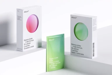
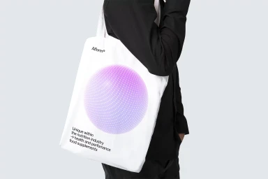
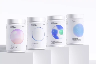
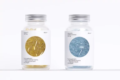
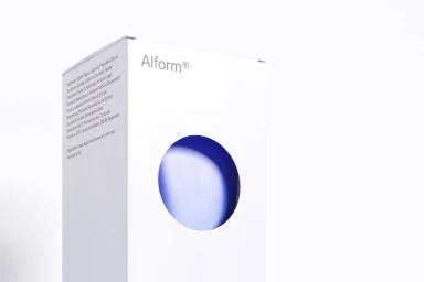
The brand identity for Alform represents a masterclass in modern, clinical minimalism within the competitive nutrition and skincare industry. Executed with a rigorous focus on clarity and structure, the project leans into a high-key studio aesthetic to translate complex health supplements into a lifestyle-forward visual language. The design system centers on a clean, white-based palette punctuated by soft-focus color gradients—ranging from vibrant pinks to cool blues—which serve as essential signifiers across a diverse product range. Through a combination of precise packaging design and sophisticated CGI elements, the work establishes a cohesive, contemporary brand identity that feels both professional and highly accessible. By utilizing sans-serif typography and consistent circular graphic motifs, the system creates a sense of systemic unity across rectangular boxes, cylindrical jars, and minimalist tote bags. Moscow Mule’s contribution to the graphic design ensures that every element, from the dot-matrix print details to the isometric product arrangements, functions with architectural precision. The integration of 3D render techniques and soft light photography elevates the brand beyond mere functional packaging, positioning Alform as a premium player in the wellness space. This approach effectively balances the clinical requirements of ingredient transparency with an editorial minimalism that demands attention on the shelf while maintaining a quiet, confident sophistication throughout every touchpoint.
Horizontal, Commercial, Clean, Minimalist
3D render / CGI
White Seamless
E-commerce / Product
