
Nordic Press Association Finland: Brand Identity
Oct 2018
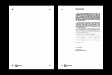
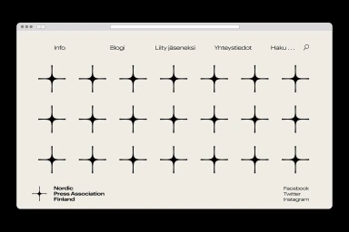
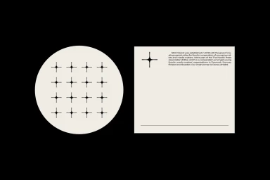
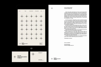
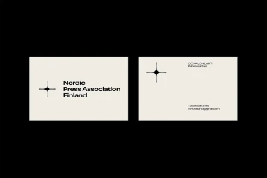
The Nordic Press Association Finland has unveiled a sophisticated new brand identity that leans into the principles of editorial minimalism and Swiss-inspired order. By harmonizing a stark, high-contrast palette of cream and black with a recurring, geometric motif of four-pointed star icons, the project establishes a visual language that feels both authoritative and contemporary. This identity succeeds by prioritizing information hierarchy, utilizing a clean, sans-serif typography that ensures clarity across every touchpoint, from official stationery and business cards to a sleek, modern UI illustration style applied to the association’s digital tablet interface and browser environments. Graphic designer Lars Högström skillfully balances these elements through a recurring grid structure that suggests a rhythmic, professional stability synonymous with institutional prestige. Rather than relying on ornamentation, the design utilizes ample negative space to frame its content, successfully bridging the gap between traditional corporate communication and modern digital interaction. The result is a highly structured, coherent system that elevates the organization's presence through its restrained application of vector motifs and meticulous layout control. By focusing on consistency, the brand identity effectively signals reliability within the media and entertainment landscape, creating a distinct, memorable aesthetic that remains both functional and visually resonant across physical and digital mediums alike.
Horizontal, Clean, Minimalist
Typography, Vector
Brand Film / Corporate Video
