
Night Shift: Brand Identity


Brand
Date
Dec 2023
Description
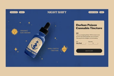
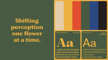
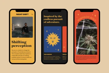
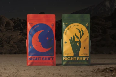
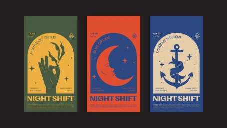
The brand identity for Night Shift centers on a fusion of retro-inflected graphic design and minimalist UI illustration. The visual system leverages a palette of deep blues, olives, and vibrant accent tones to establish a cohesive aesthetic across digital and physical touchpoints, including web interfaces and product packaging. Developed with graphic design by Labeling Theory, the identity utilizes the PP Fragment font family to ground the brand. The execution balances serif-driven typography with vector-based motifs such as celestial symbols and arched frames, maintaining a clean, structured appearance throughout the brand's digital store and cannabis-focused product lines.
Style
Horizontal, Commercial
Techniques
Vector
Associated creatives

5000+ creatives to discover
Sign up to gain access to the entire directory. It’s free.
Visie is a curated library of creative professionals.