Night & Day: Brand Identity
Feb 2026
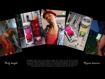
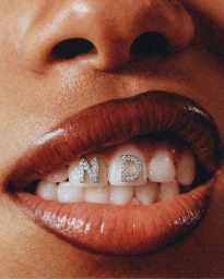
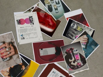
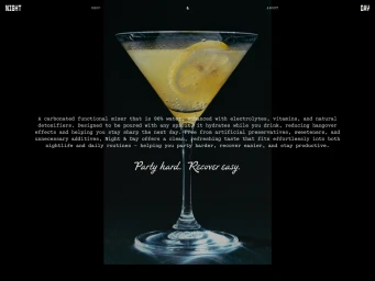
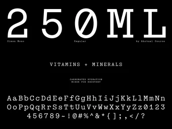
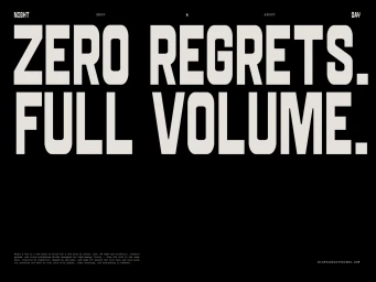
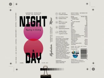
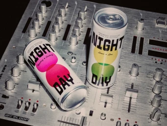
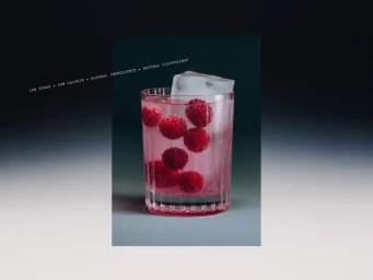
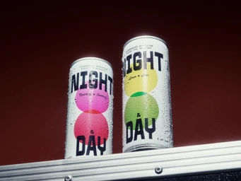
The brand identity for Night & Day, a forward-thinking player in the food and beverage industry, masterfully balances the dichotomy between high-energy nightlife and recovery-focused hydration. Through a sophisticated visual language, the project employs a collage aesthetic to bridge the gap between social spontaneity and performance-oriented wellness. Design work led by Hello Comrade and Matthew van Ede van der Pals establishes a clinical yet vibrant identity, utilizing high-contrast typography, such as the distinct Simon Mono typeface, to convey a modern, industrial edge. This design DNA is consistently applied across a variety of touchpoints, from minimalist product packaging featuring circular graphic motifs to editorial lifestyle imagery. The visual narrative is further elevated by the photography of Maciek Miloch, who employs studio strobe and natural light to capture the tactile quality of the beverage range. Whether showcasing condensation-flecked aluminum cans set against a stark red background or intimate macro portraits, the imagery leans into editorial minimalism to maintain a premium feel. The resulting brand ecosystem feels both grounded and aspirational, effectively communicating a dual-purpose message that appeals to consumers looking to party hard and recover easy. By weaving together elements of music culture, industrial design, and functional nutrition, the identity creates a cohesive, high-energy presence that resonates across both digital and physical landscapes.
Horizontal, Commercial
Advertising Campaign