
Nich: Brand Identity







Brand
Date
Sep 2025
Description
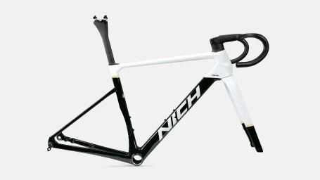
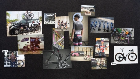
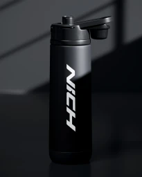
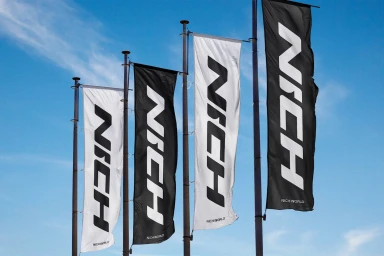
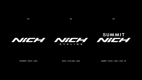
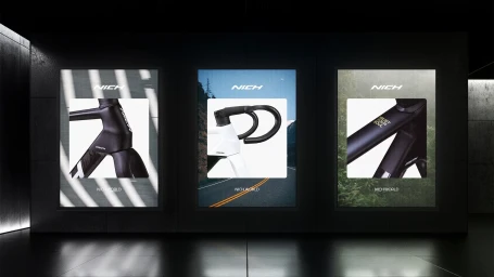
The brand identity for Nich, a sports and gaming company, spans physical retail environments, high-performance cycling equipment, and digital motion graphics. This project establishes a cohesive aesthetic centered on typographic precision, utilizing clean, minimalist layouts and a stark monochrome palette that mirrors the technical nature of road cycling. Kenshō provided the graphic design expertise, developing a series of italicized wordmarks, sub-brand lock-ups, and summit configurations. The execution shifts between commercial studio product photography and high-speed documentary footage of competitive racing, anchoring the brand in both hardware design and athletic action.
Style
Horizontal, Clean
Industries
Color
Jet Black
Pure White
Context
Advertising Campaign
Associated creatives

5000+ creatives to discover
Sign up to gain access to the entire directory. It’s free.
Visie is a curated library of creative professionals.