
Manukora: Brand Identity
Brand
Date
May 2022
Description
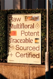
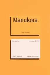
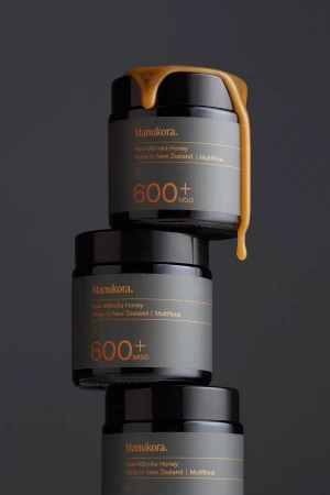
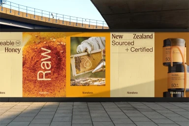
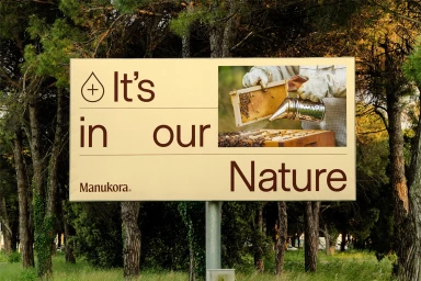
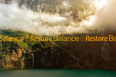
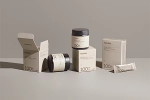
Manukora updates its brand identity with a focus on raw, traceable origins and clean, typographic-driven design. The aesthetic leans into a warm color palette of amber, cream, and deep brown, utilizing minimalist product staging and natural light to emphasize the premium nature of the honey packaging. Designed by Pendo, the identity project spans various touchpoints, including outdoor advertising, business collateral, and product photography. Each application integrates bold serif typography with textured imagery of beekeeping, grounding the visual system in its New Zealand roots while maintaining a commercial, contemporary feel.
Style
Commercial, Warm, Clean, Horizontal
Techniques
Typography
Industries
Associated creatives

5000+ creatives to discover
Sign up to gain access to the entire directory. It’s free.
Visie is a curated library of creative professionals.