
Mammamia: Brand Identity
Jun 2023
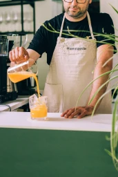
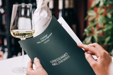
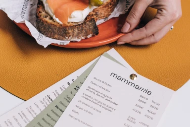
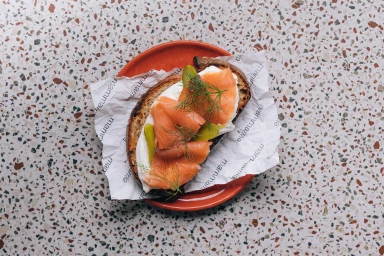
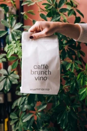
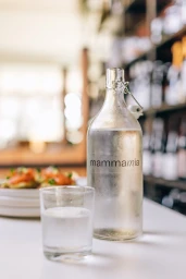
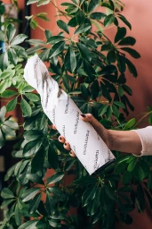
The brand identity for restaurant group Mammamia leans into a clean, hospitable aesthetic that bridges cafe and dining culture. Developed through a combination of editorial photography and minimalist typography, the project establishes a cohesive visual language centered on a palette of deep green, warm terracotta, and neutral whites. The visual system, designed by Caterina Appignani, integrates custom serif typography across various touchpoints, including printed menus, parchment packaging, and a dedicated wine catalog. Complementing the graphic work, photography by Adrian Lungu employs natural light and shallow depth-of-field to emphasize organic textures—from sourdough toast and smoked salmon to lush tropical foliage—creating a consistent, lifestyle-driven presence for the brand across its hospitality spaces.
Clean, Commercial
Natural light
Advertising Campaign

