
Lulu Wellness: Brand Identity



May 2024
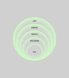
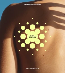
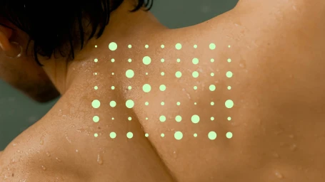
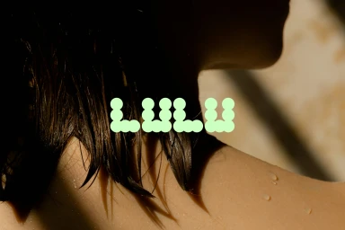
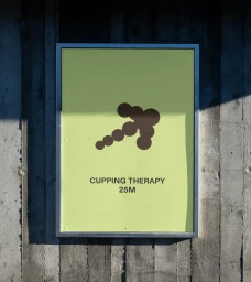
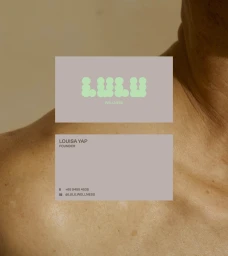
Lulu Wellness tasked Sunny Side Up with crafting a brand identity that bridges ancient therapeutic traditions with a contemporary commercial aesthetic. The resulting visual system leans into minimalist graphic design, utilizing precise geometric patterns and soft, natural light to communicate a sense of calm and restoration. The project incorporates a restrained color palette of muted earth tones and vibrant pastels. Sunny Side Up developed a typographic language that integrates dot-matrix elements and clean sans-serif layouts across digital and print collateral. The identity balances technical information with abstract, circular motifs that mirror the physical markings of cupping therapy, framing the treatment within a modern lifestyle context. Beyond static assets, the branding extends into motion graphics, featuring dynamic halftone patterns that reinforce the clinic's focus on balance and energy. The documentation includes business card design and interior signage, maintaining visual consistency across every customer touchpoint.
Commercial, Clean
Typography
Advertising Campaign
