Logo
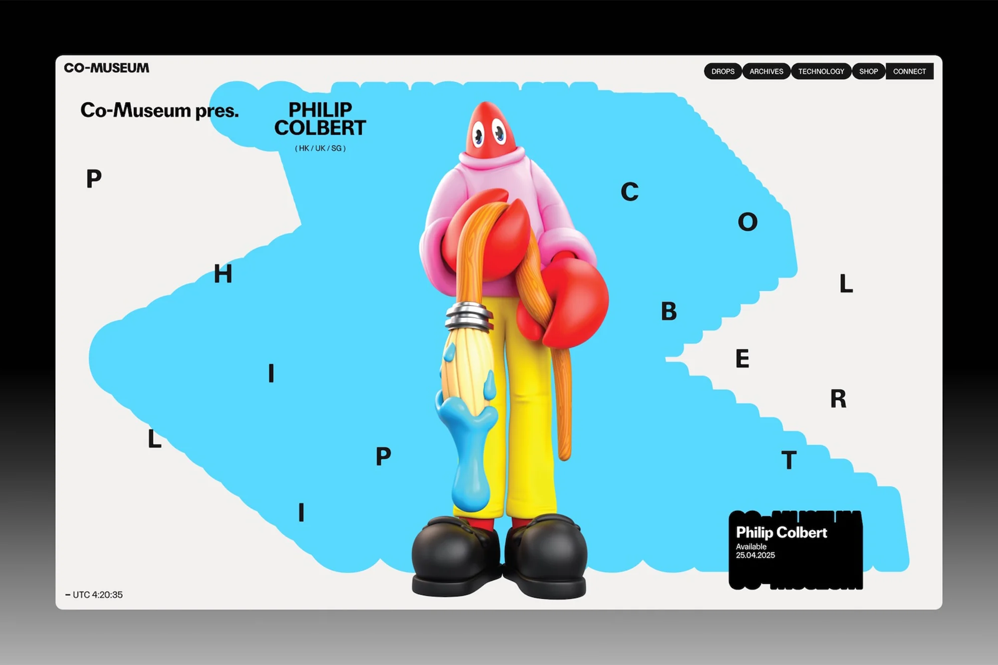
Co-Museum brand identity web page featuring a surreal red-headed character holding a paintbrush against a bright blue shape
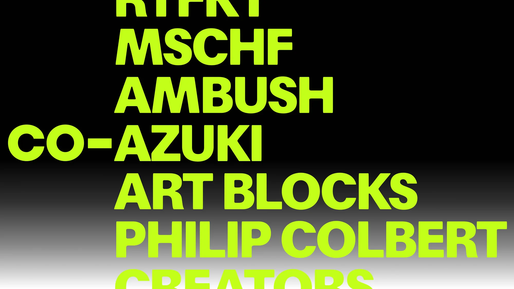
Bold lime green sans-serif typography listing brand names against a dark gradient background.
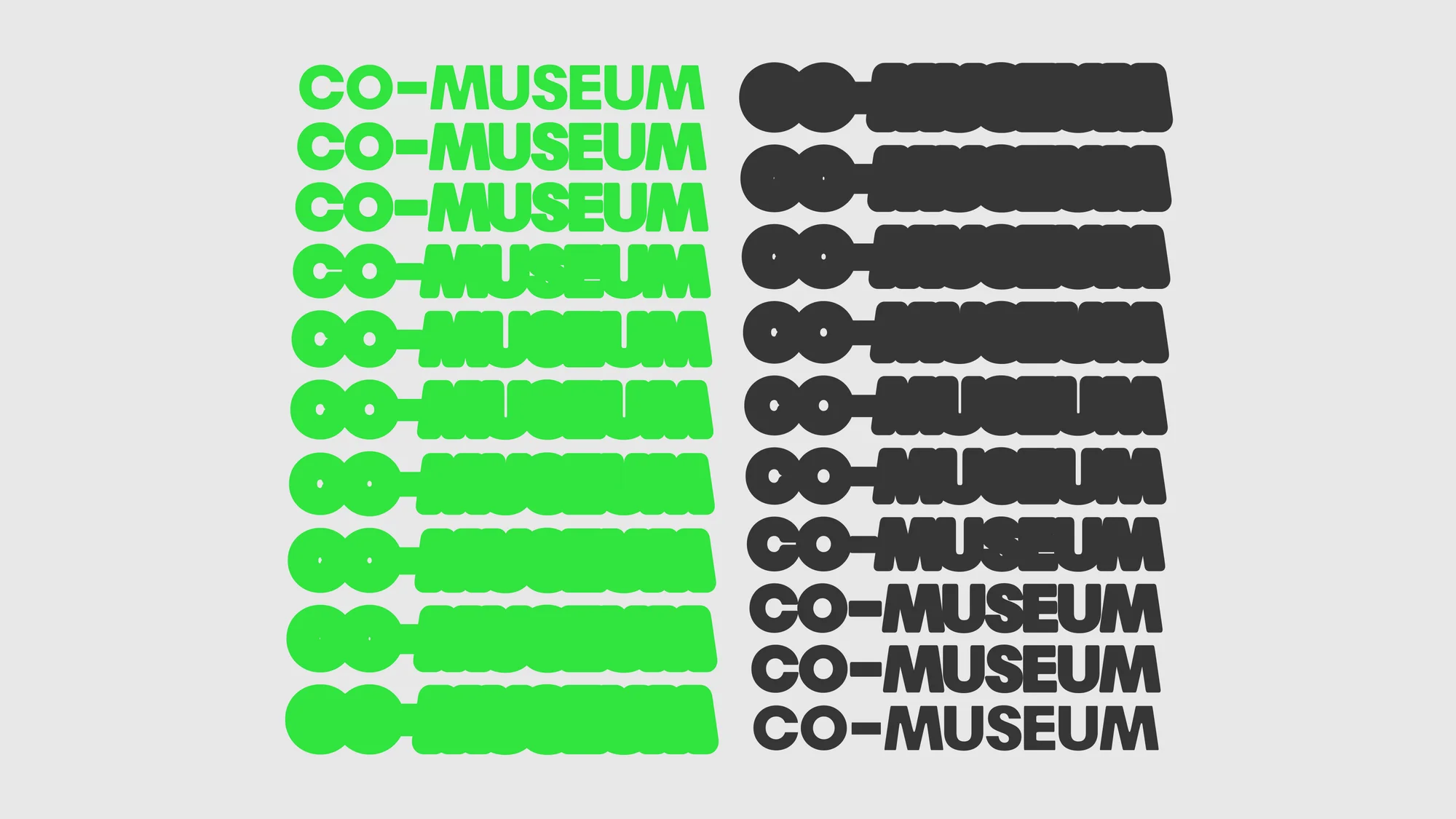
Graphic design brand identity showing repeating green and dark grey Co-Museum typography on light grey background
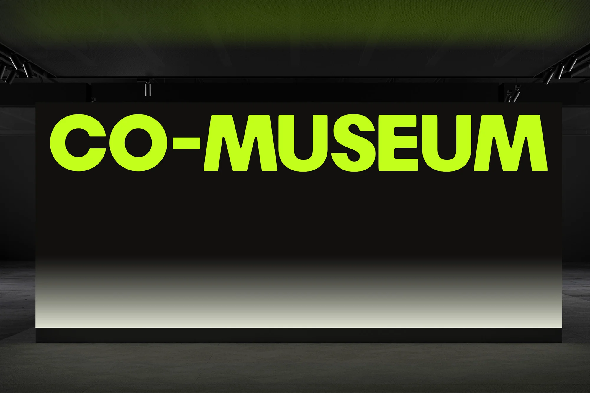
Bright neon green typography spelling CO-MUSEUM on a large black rectangular sign set against a dark architectural background.
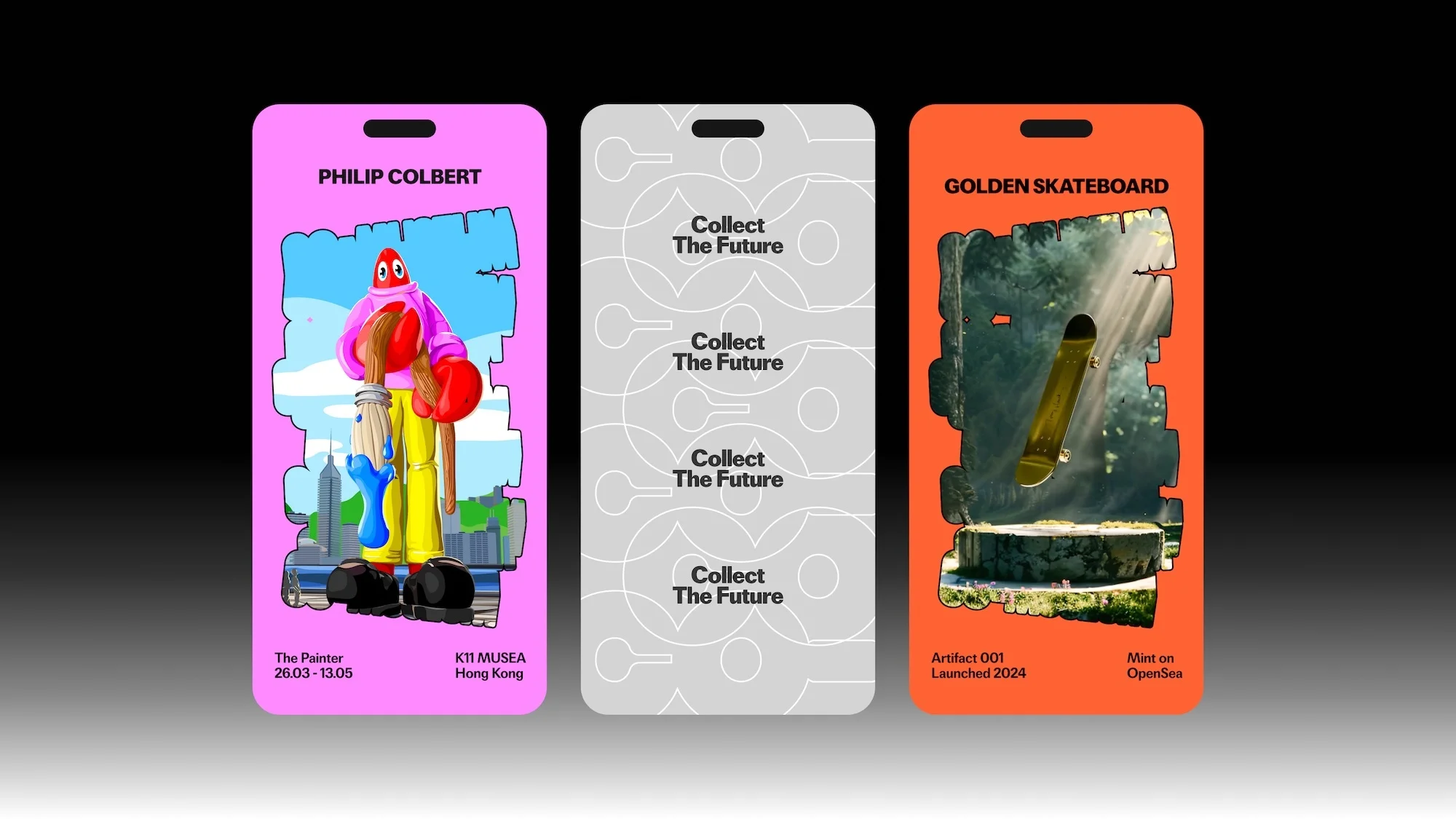
Three vertical badge designs for Co-Museum showcasing graphic artwork, repeating typography, and a skateboard graphic.
Co-Museum brand identity web page featuring a surreal red-headed character holding a paintbrush against a bright blue shape
Bold lime green sans-serif typography listing brand names against a dark gradient background.

Co-Museum Brand Identity 2025

About

The brand identity for Co-Museum, developed by design studio Sunny Side Up, establishes a visual language centered on high-contrast typography and digital-first graphic design. The project incorporates motion graphics and vector illustrations to translate the institution’s programming across multiple platforms, from web interfaces to event-specific digital assets. The visual system leans into minimalist layouts and bold, neon color palettes—notably lime green and vibrant pink—to create a distinct presence for the museum. Across both static and animated applications, the work uses experimental chromatic gradients and clean sans-serif type to maintain a cohesive look. This identity serves to bridge the gap between contemporary digital culture and institutional gallery branding.

Brand

Credits

Styles

5000+ profiles to discover

Sign up to gain access to the entire directory. It’s free.

Visie is a curated library of creative professionals.
Trusted by