
Lesse: Brand Identity
Jan 2019
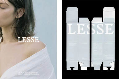
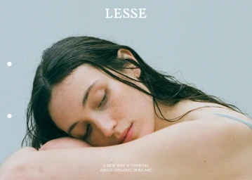
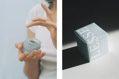
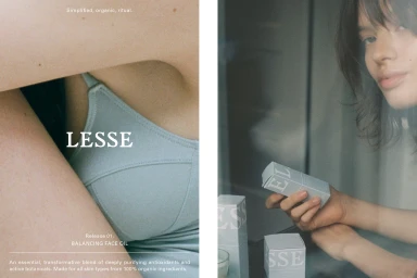
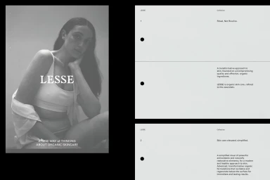
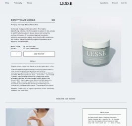
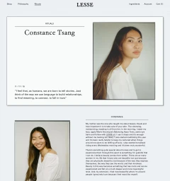
The brand identity for Lesse reimagines the intersection of organic skincare and premium editorial design, grounding the label in a visual language of calm and intentionality. Through a masterclass in minimalist composition, the project leans into a sophisticated, desaturated palette of blue-grey and soft neutrals that echo the brand’s focus on natural, restorative ingredients. The creative direction, bolstered by the graphic design expertise of Natasha Mead, utilizes elegant serif typography to anchor the layout, creating a seamless dialogue between the product and the consumer. Each visual asset—from the close-cropped portraiture of Constance Tsang to the precise flat-lay technical imagery—functions as a deliberate component of an overarching ritual, emphasizing the transition from routine to restorative practice. The work employs cinematic natural light and soft lighting techniques to highlight organic skin textures and matte packaging surfaces, reinforcing a clinical yet approachable feel. By blending corporate UI precision with high-end editorial storytelling, the identity successfully positions Lesse not just as a beauty range, but as a lifestyle philosophy. This cohesive aesthetic, clearly articulated across digital interfaces and print-ready panels, ensures that the brand remains consistent, refined, and tactile, inviting the viewer into a space where every visual choice serves the singular narrative of simplified, mindful skincare.
Editorial, Horizontal, Clean, Minimalist
Natural light
White Seamless
