
Les Enfants: Brand Identity



May 2020
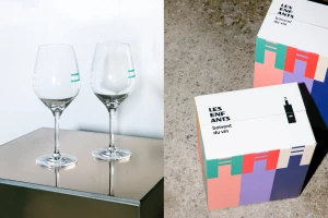
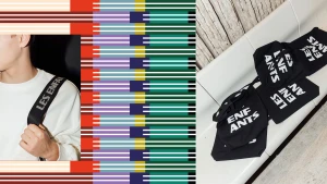
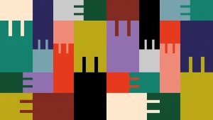
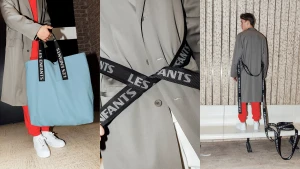
The brand identity for Les Enfants is a masterclass in geometric play and structural minimalism, successfully bridging the gap between high-end fashion and commercial product design. By leaning into a vibrant, primary-hued palette and repeating vertical motifs, the project creates a cohesive visual language that feels both playful and incredibly disciplined. The execution hinges on the intersection of stark, industrial settings and bold graphic assets, utilizing flat, vector-based compositions that feel at once modern and timeless. Kelly Jacob captures this duality through sharp, flash-lit photography, grounding the brand's abstract typography and modular color-blocking in tangible, lived-in scenarios. Whether it is the rhythmic, repeating patterns on corrugated shipping boxes or the tactile application of branded straps on apparel, every element is designed to resonate with an editorial sensibility. Harrison Fun brings this aesthetic to life through precise graphic design, while Nord injects energy into the brand’s lifestyle storytelling through purposeful animation. The use of negative space and clean, light-filled environments ensures the branding remains versatile across both digital and physical touchpoints. Ultimately, the work functions as a complete system, where each asset—from the U-shaped, interlocking patterns to the minimalist logotypes—contributes to a sophisticated, highly graphic identity that demands attention without the need for unnecessary clutter, perfectly encapsulating the brand's spirited, architectural ethos.
Horizontal, Commercial, Clean, Graphic


