
KUNSTHAL: Brand Identity

May 2020
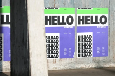
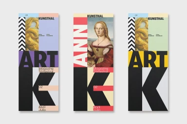
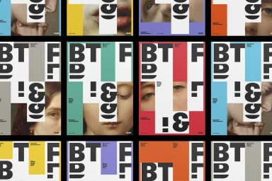
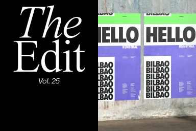
The brand identity for KUNSTHAL stands as a masterclass in modular graphic design, seamlessly bridging the gap between classical art heritage and contemporary visual communication. Through a sophisticated application of typography, the project leans into a grid-based layout that functions as both a flexible framework and a bold statement of institutional intent. By juxtaposing Renaissance-style portraits with large-scale, minimalist sans-serif lettering, the creative team has developed a visual language that feels inherently modern yet rooted in history. The execution channels a deliberate tension between historical imagery and vibrant, geometric fields of color, such as striking shades of lime green, purple, and high-contrast orange. Whether applied to wheat-pasted posters on weathered concrete or structured magazine covers, the design maintains a rigorous consistency through its systematic use of negative space and clear alignment. With contributions from studios such as Husmee, Simple, Studio Alba, Tim Semple Studio, and Ricardo d'Avila, the identity project avoids stylistic clutter in favor of a sharp, editorial minimalism. This body of work demonstrates how intentional geometric graphic design principles can anchor brand presence in diverse urban environments, utilizing techniques like collage and motion graphics to ensure the brand remains dynamic, highly legible, and visually arresting within the competitive landscape of public and institutional branding.
Clean, Horizontal, Commercial, Graphic
Typography
Advertising Campaign


