
Bookmark
Brand Identity
Oct 2017
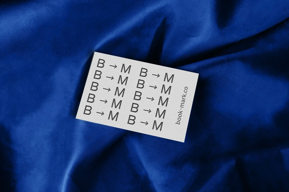
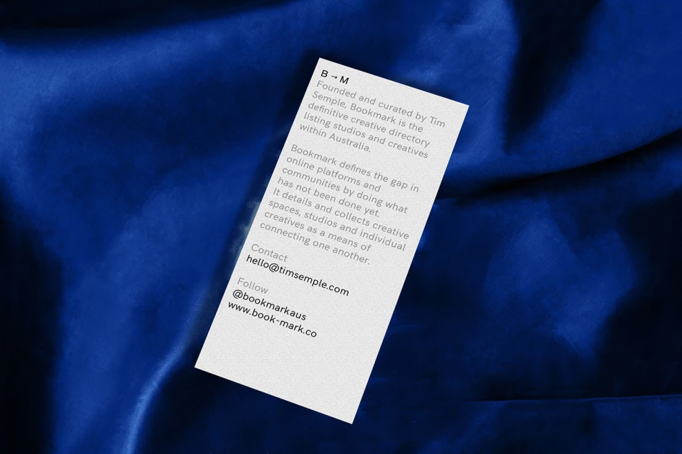
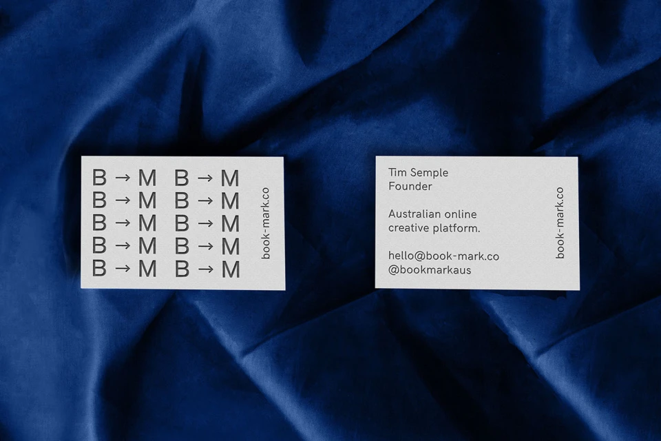
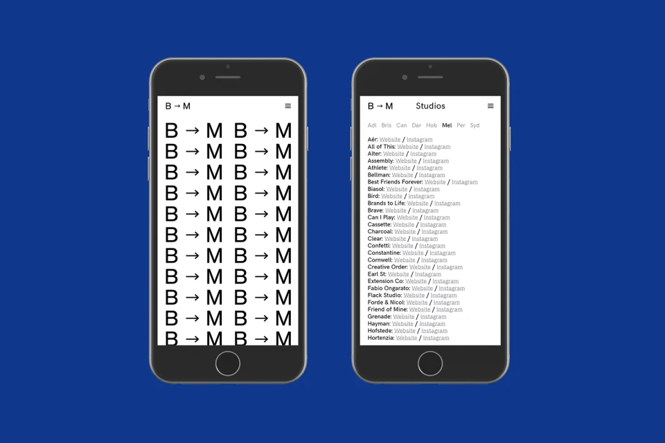
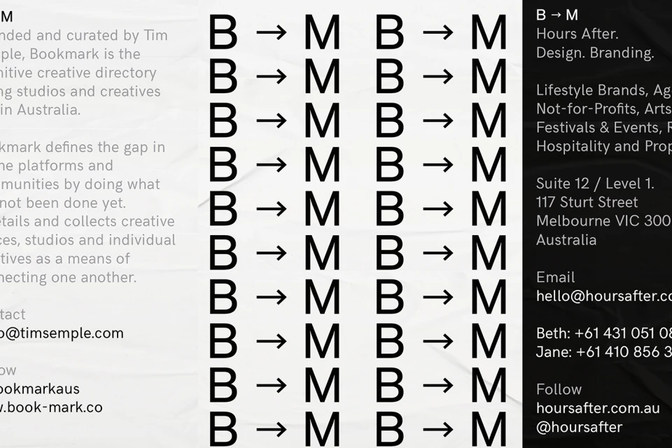
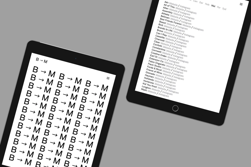
The brand identity for Bookmark, an essential Australian creative directory, masterfully balances the tactical precision of a professional network with a sophisticated, modernist aesthetic. Executed with the clean, minimalist graphic design sensibilities of Tim Semple Studio, the project anchors its visual language in a recurring B-arrow-M motif that functions as a rhythmic, semiotic shorthand for the platform’s mission. This bold typography and structured grid system are presented across a variety of corporate touchpoints, from tactile printed stationery to intuitive digital interface designs. The physical collateral leans into high-contrast commercial photography, where the starkness of matte white cards is juxtaposed against deep, royal blue velvet, highlighting the intersection of form and texture. Complementing this, the UI illustration across tablets and smartphones maintains a strictly monochromatic palette, ensuring that the navigation remains as functional and sharp as the printed assets. By distilling complex agency data into a streamlined, alphabetized, and highly legible visual system, the identity effectively serves its dual purpose as both a functional tool for industry networking and a compelling representation of creative excellence. The project avoids unnecessary ornamentation, instead favoring an editorial minimalism that allows the clarity of the typography and the consistency of the branding to speak for itself, ultimately creating a cohesive and memorable identity for a modern online creative space.
Horizontal, Commercial, Clean
