
Kintaro: Brand Identity



Mar 2019
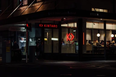
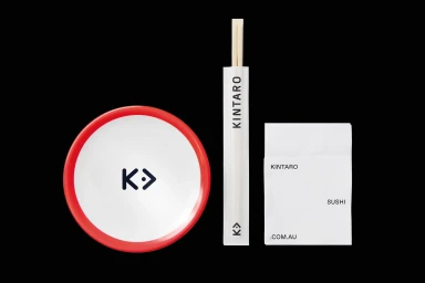
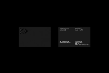
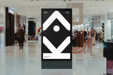
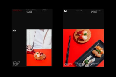
Kintaro establishes a commanding presence in the restaurant and food & beverage industry through a brand identity that leans into a sophisticated, high-contrast visual language. By leveraging a bold palette of deep black and vibrant red, the project achieves an edgy, urban aesthetic that feels both modern and timeless. The design system, crafted with graphic design excellence by Simple, excels in its application across diverse touchpoints, from the tactile precision of debossed business cards to the cinematic scale of glowing neon exterior signage. Throughout the collateral, the use of cinematic, low-key lighting and minimalist typography creates a cohesive narrative that bridges the gap between functional corporate identity and immersive hospitality experience. Whether viewed on a high-traffic digital advertising screen or within the intimate framing of a menu interface, the work remains anchored by its sharp, geometric icons and a commitment to editorial minimalism. The photography employs a mix of commercial techniques, including soft light and natural light, to highlight the texture of food and the industrial mood of the restaurant interior. By stripping away extraneous noise, the brand identity creates a clean, authoritative voice that feels perfectly at home in a contemporary urban environment, proving that thoughtful, disciplined design remains the most effective tool for defining a space and capturing the attention of a discerning audience.
Horizontal, Commercial, Clean
