
Justworks
Brand Identity

Oct 2020
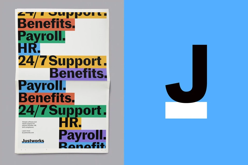
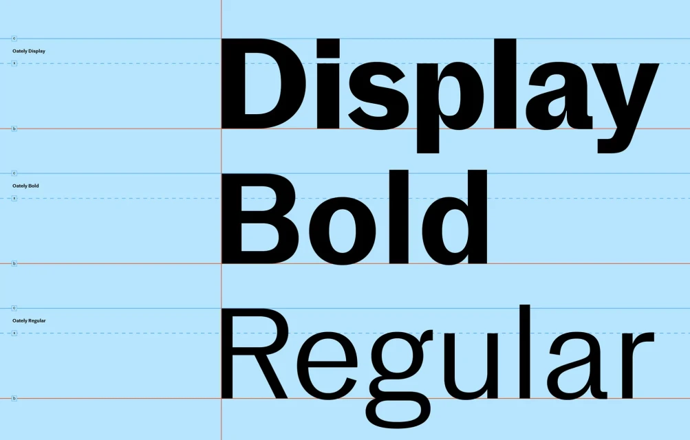
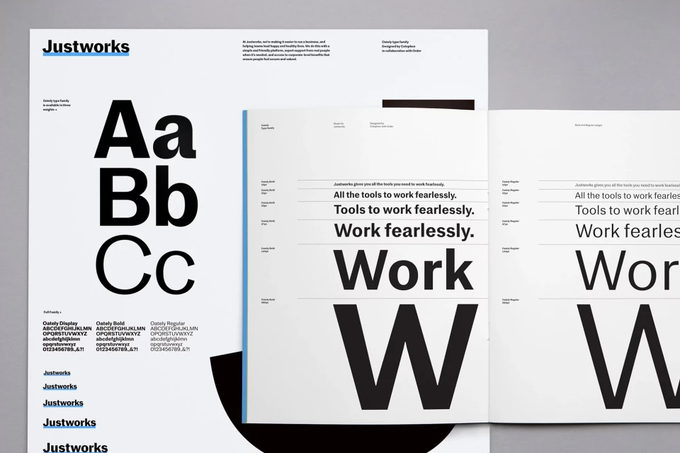
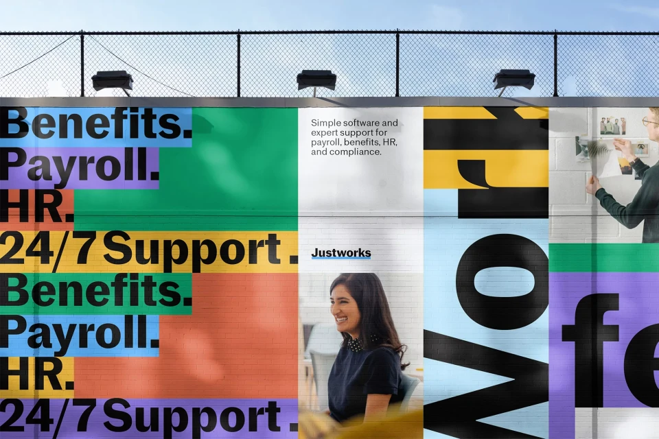
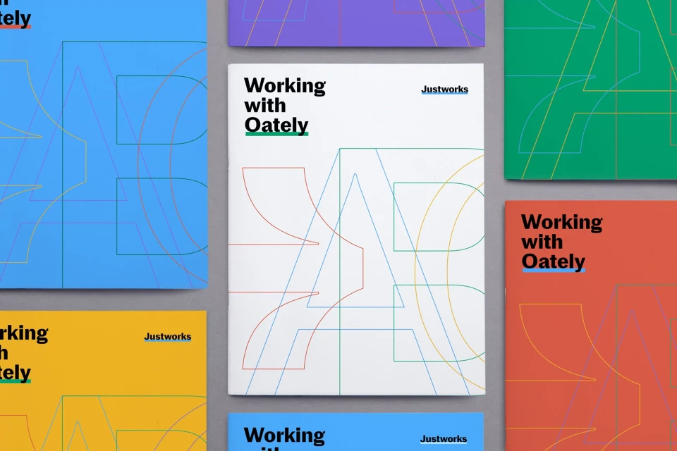
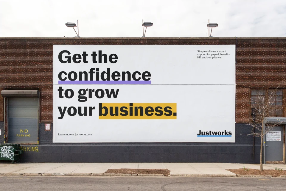
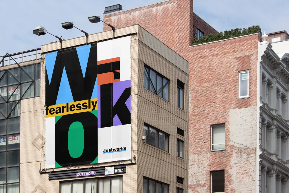
Justworks’ brand identity overhaul leans into a structured, high-contrast visual system that balances corporate utility with a playful palette. Designed by Order, the identity relies on bold, sans-serif typography as its core anchor, often set against clean backgrounds punctuated by vibrant blocks of yellow, orange, green, blue, and purple. The project spans a wide array of touchpoints, including printed collateral, mobile interface mockups, and large-scale outdoor signage. Technically, the work emphasises precision through a rigorous grid system and minimal composition. The application across both static graphic design and dynamic motion graphics showcases a cohesive visual language where type scale and colour blocking communicate HR and payroll benefits with clarity. Photography is integrated sparingly, adding a human element to the otherwise rigid and geometric layout.
Horizontal, Commercial, Clean
Typography
Apps & Digital Platforms
