
Justworks Brand Identity 2020
Associated creatives

Tags
Description
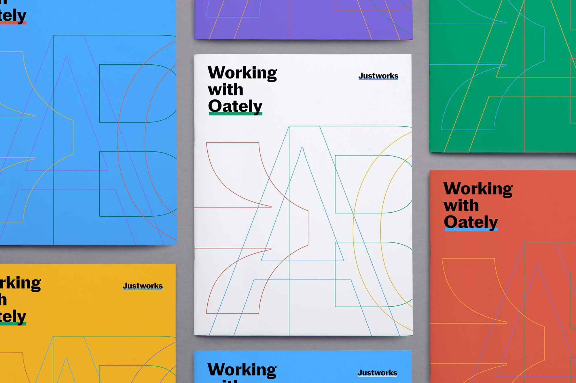
This flat lay photograph showcases a branding identity project featuring multiple colorful printed brochures arranged on a neutral grey background. The central white brochure bears bold typography reading Working with Oately alongside the Justworks brand logo, overlaid with intricate fine-line geometric letterforms in blue, red, and green. Surrounding items display vibrant solid color fields in blue, purple, green, yellow, and red, each utilizing consistent linear typography and abstract line art patterns. The composition is captured from a direct top-down perspective with clean, even studio lighting that accentuates the smooth matte paper textures and crisp graphic lines. Designed with a structured grid system, the collateral highlights modern corporate identity elements through a bright and playful color palette.
Style
Horizontal, Commercial, Clean, Minimalist, Graphic
Techniques
Typography
Industries
Apps & Digital Platforms
Background
Grey Seamless
Context
Advertising Campaign