
Jacques-Ouellette School Foundation: Brand Identity

May 2019
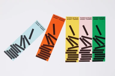
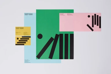
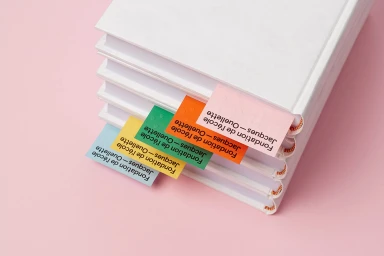
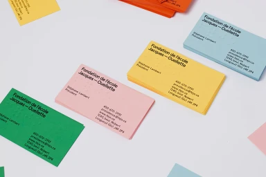
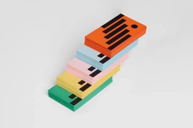
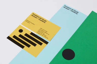
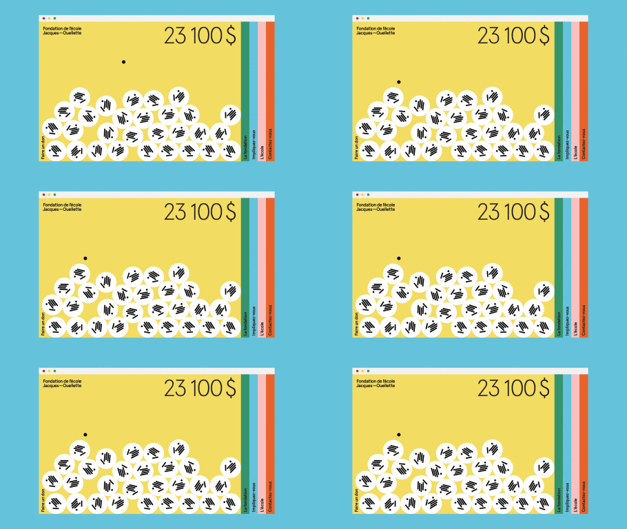
The brand identity for the Jacques-Ouellette School Foundation serves as a masterclass in accessible design, blending corporate professionalism with a vibrant, inclusive visual language. Spearheaded by graphic designers Simon Langlois and Raphaëlle Brillant-Marquis, the project establishes a cohesive system that feels both academic and deeply human. Central to the identity is the intentional use of typography and tactile elements, most notably the integration of embossed Braille across all stationery, which ensures the foundation's mission of accessibility is embedded into its very surface. The execution leans into a bold, primary-focused color palette, utilizing shades of grass green, sunshine yellow, and soft pink to project a sense of optimism and approachability. This project expertly employs high-key lighting and minimalist composition to emphasize the interplay between sharp black geometric shapes and clean, matte textures. Whether through the cascading layout of color-blocked bookmarks or the playful, structured imagery of logo-marked table tennis balls, the identity captures a modern aesthetic that balances technical rigor with a welcoming, friendly spirit. By combining corporate design principles with thoughtful, inclusive details, the team has crafted a distinctive brand identity that is as conceptually rigorous as it is visually striking. The resulting suite of assets, which includes everything from stationery to UI illustration, demonstrates how deliberate graphic design can transform essential organizational communications into an engaging and unified brand experience.
Horizontal, Commercial, Clean, Minimalist
Typography
White Seamless
Advertising Campaign

