
ProjectBrand Identity
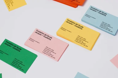
Jacques-Ouellette School Foundation Brand Identity 2019
Associated creatives


Tags
Description
This graphic design project showcases a vibrant brand identity for the Jacques-Ouellette School Foundation, created by Simon Langlois and Raphaëlle Brillant-Marquis. The composition features neatly arranged stacks of business cards in cheerful pastel and bright shades, including green, pink, yellow, blue, and orange. Each card prominently displays clean typography alongside tactile, embossed Braille dots. The clean, minimalist white background emphasizes the colorful cards and their tactile details, highlighting professional branding craftsmanship.