
ProjectBrand Identity
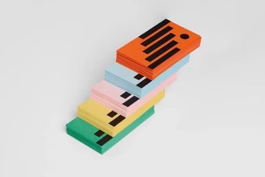
Jacques-Ouellette School Foundation Brand Identity 2019
Associated creatives


Tags
Description
This brand identity project for the Jacques-Ouellette School Foundation features a diagonal arrangement of stacked, colourful printed cards. The composition displays vibrant stacks in orange, light blue, pink, yellow, and green, each marked with distinct black graphic elements on the top surface. The items are set against a clean, neutral white background under soft, even studio lighting. Graphic design for the project is credited to Simon Langlois and Raphaëlle Brillant-Marquis.