
Staris: Brand Identity


May 2026
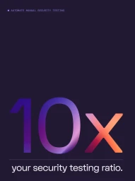
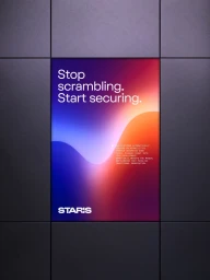
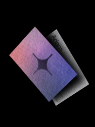
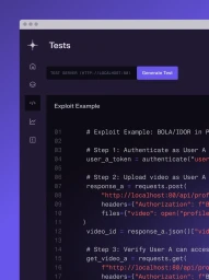
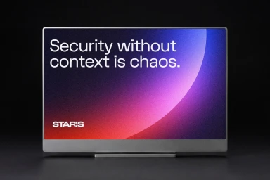
The new brand identity for Staris marks a masterclass in modern, corporate design, seamlessly blending technical precision with a high-end aesthetic. Executed with a sophisticated motion and design sensibility by the team at Gold Front, the visual language revolves around a striking purple-to-orange gradient that serves as the project's kinetic heartbeat. This gradient transitions across diverse applications, from fluid digital displays and 3D render/CGI assets to tactile, premium print finishes that elevate the brand's security-focused narrative. By integrating UI illustration with a minimalist approach, the project effectively translates complex cybersecurity concepts into clean, accessible visuals that feel both innovative and reliable. The identity leans into a bold, sans-serif typography that grounds the abstract elements, communicating technological authority through a sharp, deliberate use of space and color. Whether seen in the grainy, atmospheric gradients of digital interface mocks or the textured, studio strobe portraiture of lifestyle shots, the design maintains a cohesive professional character. Through the creative direction of Gold Front, the Staris brand successfully navigates the tension between abstract digital security and human-centric corporate messaging, utilizing a sleek visual toolkit to ensure every touchpoint, from code editors to apparel, resonates with a consistent, authoritative, and forward-thinking philosophy that defines the modern B2B software landscape.
Vertical, Clean
