
Hudson Mohawke: Brand Identity
Aug 2019
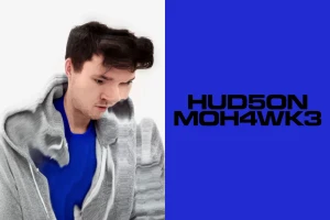
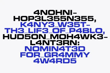
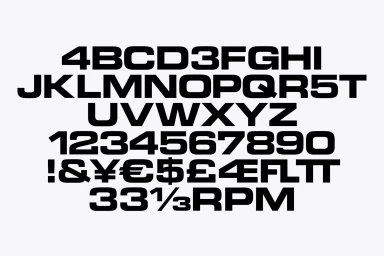
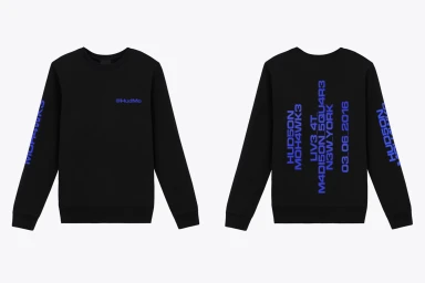
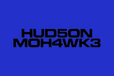
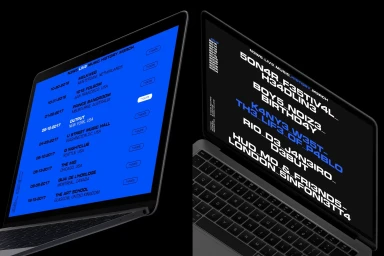
The brand identity for electronic producer Hudson Mohawke marks a sophisticated evolution in the intersection of music, media, and entertainment branding. Executed by the design studio HelloMe, the project strips away extraneous noise, favoring a stark, utilitarian aesthetic that leans heavily into contemporary minimalism. At its core, the visual language utilizes a custom, heavy-weight sans-serif typeface, incorporating leetspeak-style numerical substitutions to inject a sharp, digital-first edge into the artist's name. This typography serves as the bedrock for the entire identity, grounding high-contrast layouts that frequently juxtapose deep royal blue against monochromatic black and white backgrounds. The project demonstrates an expert command of graphic design principles, from the rhythmic balance of a typography specimen sheet to the calculated symmetry of its UI illustration work. Beyond static graphic assets, the identity incorporates VFX and visual effects, notably applying digital motion-blur to promotional portraiture to blur the lines between traditional studio photography and kinetic art. This cohesive system extends seamlessly from digital interface designs and tour scheduling portals to apparel, maintaining a rigorous consistency across every touchpoint. Ultimately, the work functions as a masterclass in modern corporate branding, stripping away the superfluous to establish an instantly recognizable, punchy, and highly legible visual rhythm that reflects the innovative nature of Mohawke’s electronic soundscape.
Horizontal, Commercial, Graphic
Typography
