
Brand
ProjectBrand Identity
House of Cans Brand Identity 2021
Associated creatives


Tags
Description
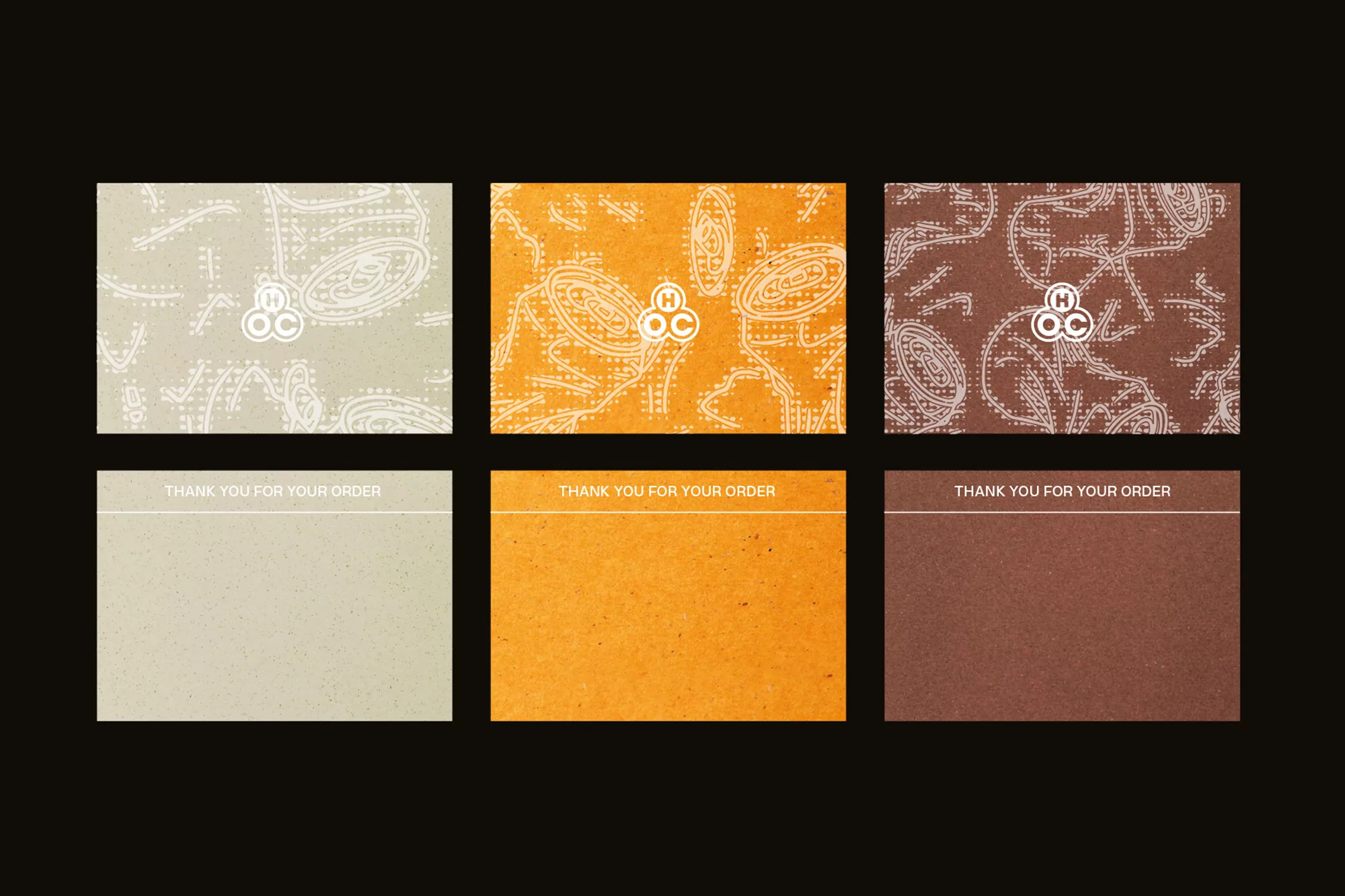
This project showcases the brand identity for House of Cans, created by IYA Studio with photography by Jonathan Donovan. The image displays six rectangular cards arranged on a dark ground, featuring distinct earth-toned surfaces in beige, orange, and brown. The top row presents patterned cards with intricate linear graphics and the brand logo, while the bottom row displays solid textured cards with the text thank you for your order. The composition highlights tactile paper finishes and a cohesive natural color palette.