
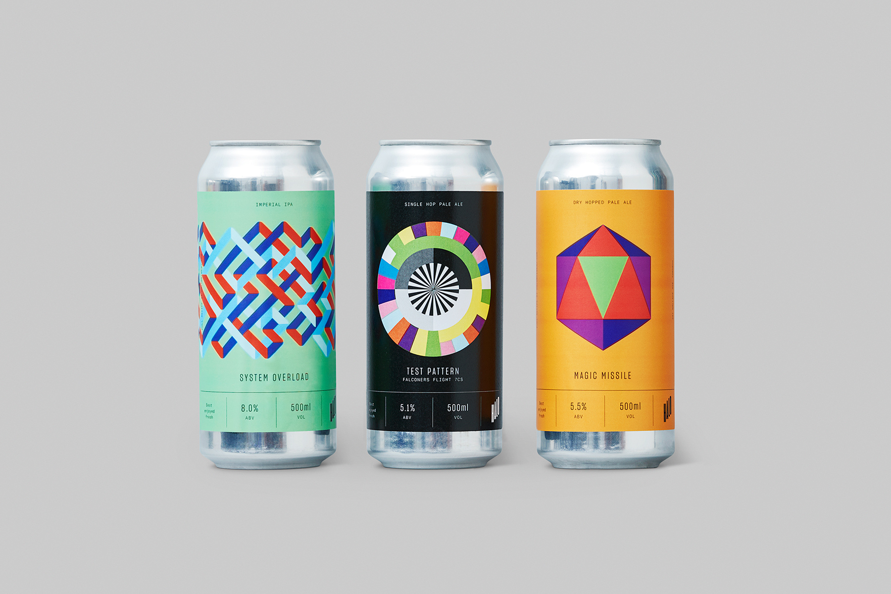
Halo Brewery Brand Identity 2018
Associated creatives

Tags
Description
Three aluminum beverage cans stand upright in a straight row against a neutral light grey backdrop, showcasing distinct graphic label designs. The can on the left features a light green label with a complex red and blue interwoven geometric pattern and text reading SYSTEM OVERLOAD. The center can has a dark black label displaying a circular color test pattern and the title TEST PATTERN. The right can features a warm yellow-orange label with a large central geometric prism design and the title MAGIC MISSILE. Each can includes standardized product details such as alcohol percentage and volume near the base. The lighting is clean and even, casting soft shadows beneath each cylindrical container.
Style
Horizontal, Commercial, Clean, Minimalist, Graphic, Geometric
Industries
Alcoholic Beverages
Color
Background
Grey Seamless
Context
Advertising Campaign, E-commerce / Product