
Go Dharmic: Brand Identity


Brand
Date
Jun 2022
Description
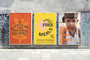
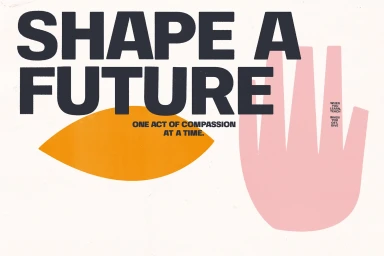
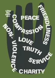
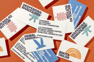
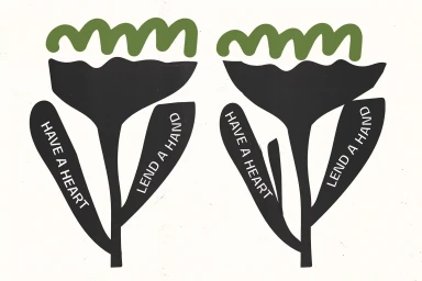
Go Dharmic introduces a comprehensive brand identity system developed by Korak Studio, focusing on a cohesive visual language for the non-profit organization. The work spans across multiple collateral pieces, utilizing a clean, minimalist aesthetic with bold typography and organic graphic shapes. The project channels a vibrant color palette, incorporating matte textures and high-contrast vector illustrations to communicate the charitable mission. Across printed posters, stationery, and event branding, the design utilizes a screen print aesthetic to maintain a clear, impactful visual presence.
Style
Horizontal, Clean
Techniques
Typography
Industries
Color
Pure White
Jet Black
Context
Advertising Campaign
Associated creatives

5000+ creatives to discover
Sign up to gain access to the entire directory. It’s free.
Visie is a curated library of creative professionals.