
DIG IN Art Diner: Brand Identity




Jun 2022
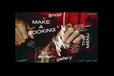
The brand identity for DIG IN Art Diner establishes a cohesive visual language that balances urban aesthetic with functional design. Developed by Korak Studio, the identity leans into a restrained palette of sage green, off-white, and deep red, utilizing bold, custom typography across both digital and physical touchpoints. Photography by Gabriella Szeplaki and Tatjana Zlatkovic captures the brand in situ, from street-level signage and staff portraiture to moody, low-key product shots of beverage service and merchandise. Techniques such as editorial-style flat lays and minimalist compositions highlight the tactile quality of the diner's collateral. The project integrates graphic design elements throughout, emphasizing the consistency of the brand’s visual system as it translates from stationery and menu cards to apparel and packaging.
Vertical, Clean, Commercial
Natural light
Advertising Campaign

