
Finer Sounds
Brand Identity

Mar 2026
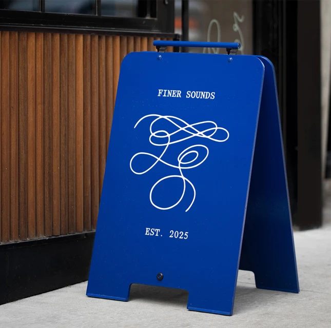
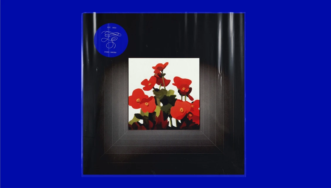
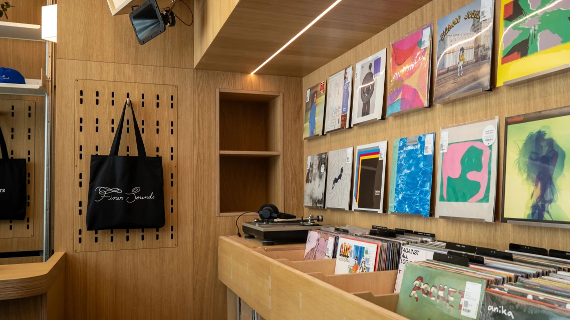
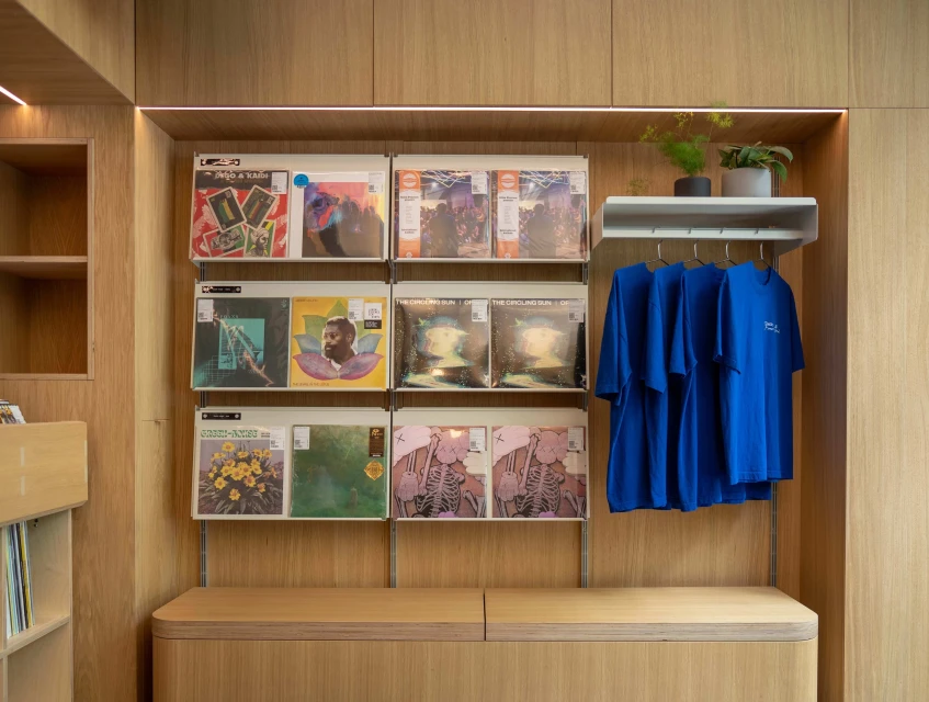
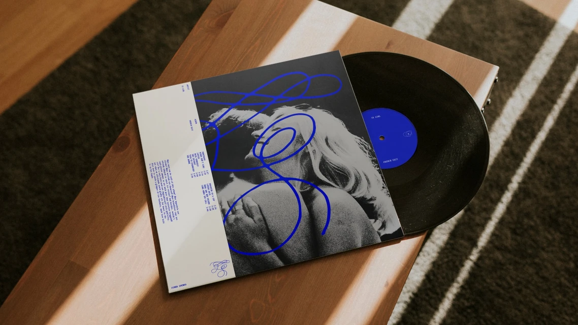
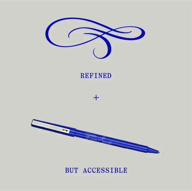
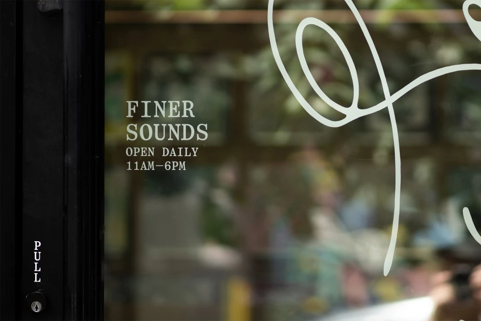
The Finer Sounds brand identity project serves as a masterclass in modern retail aesthetics, successfully translating a passion for music culture into a cohesive and tactile visual language. Helmed by the design team at Gretel, the project articulates a sophisticated yet accessible vision through a blend of commercial design and lifestyle imagery. The identity leans into a striking, monochromatic blue and grey palette, punctuated by organic floral motifs and sharp, geometric framing. By integrating clean, contemporary vector graphics with natural light photography, the branding feels both professional and intimately human. The retail environment itself, captured with minimalist precision, features warm oak paneling and intentional merchandising that reflects a deep understanding of the intersection between art and commerce. Whether through the crisp typography on storefront glass or the delicate ink-sketched cover art of vinyl records, the work channels a sense of refined craftsmanship. The project uses cinematic lighting to add texture to its clean lines, ensuring that every touchpoint—from embroidered tote bags to custom signage—feels curated. This is not merely a logo exercise; it is a full-scale environmental system that establishes Finer Sounds as a destination for the modern audiophile, prioritizing a high-end sensory experience that remains grounded in the authentic, tactile nature of record collecting and music appreciation.
Commercial, Clean, Horizontal
Advertising Campaign
