
BrandFiner Sounds
ProjectBrand Identity
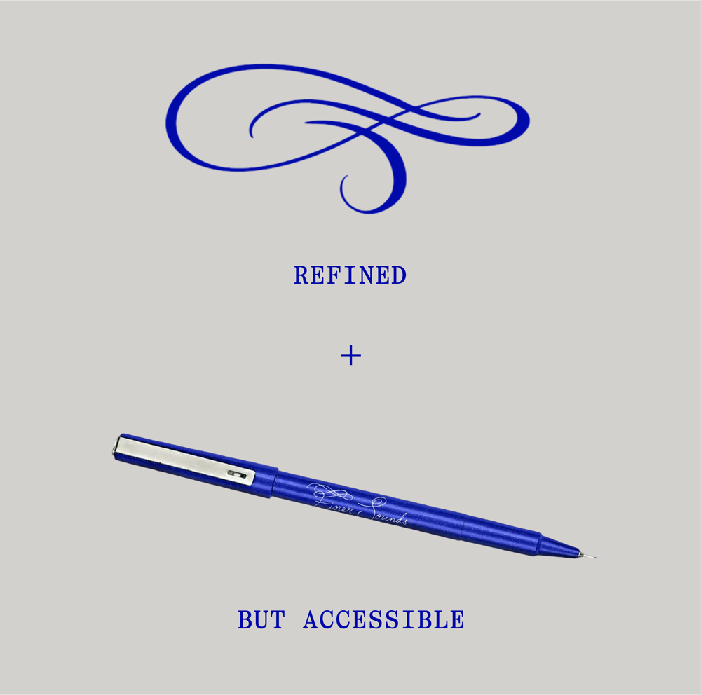
Finer Sounds Brand Identity 2026
Associated creatives

Tags
Description
This graphic design image for the Finer Sounds brand identity showcases a blue ballpoint pen positioned diagonally on a solid light grey background. Above the pen, an elegant blue typographic swirl flourish sits above the word REFINED, followed by a plus sign. Below the pen, the word BUT ACCESSIBLE appears in matching blue typography. The composition is clean, minimalist, and centered, emphasizing the corporate brand styling created by Gretel.
Style
Vertical, Commercial, Clean, Minimalist
Techniques
Typography
Color
Cobalt (20%)
Background
Grey Seamless
Context
Advertising Campaign