
EO: Brand Identity
Apr 2023
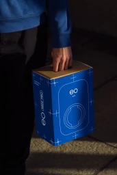
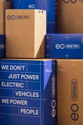
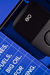
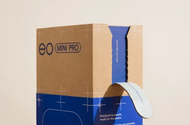
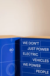
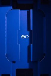
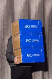
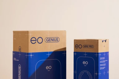
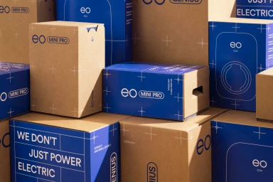
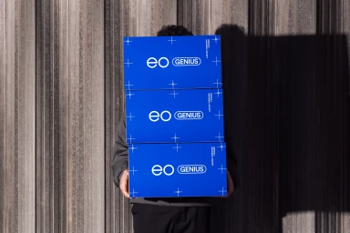
The brand identity for EO centers on a refined, industrial aesthetic, focusing on the company's product packaging system. The visual strategy leans into a clean, minimalist design language, utilizing a bold palette of vibrant blue paired with natural brown cardboard textures to establish a professional presence for their hardware solutions. Captured by photographer Murray Orr, the campaign employs natural light and directional studio lighting to emphasize precision. Graphic elements, including technical blueprint-style grid lines and clean white sans-serif typography, appear across the packaging, highlighting the functionality of the EO Mini Pro and EO Genius devices. This work was developed with graphic design by Human Resources and print production by Denmore Press.
Vertical, Commercial, Clean
E-commerce / Product


