
Ding: Brand Identity


Apr 2025
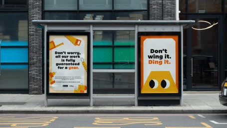
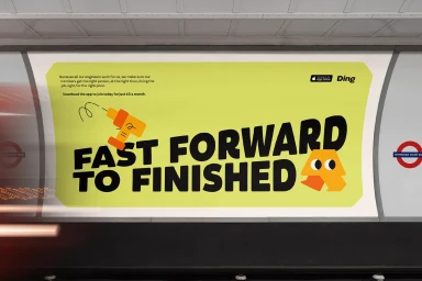
Wildish & Co. developed the comprehensive brand identity for Ding, a services platform characterized by a playful, minimalist aesthetic. The project integrates flat vector illustration and motion graphics, utilizing a warm palette of yellow, orange, and red to build a cohesive visual system. This design approach is applied across both digital and physical touchpoints, ranging from transit-based outdoor advertising to website interfaces and custom app UI. The identity relies on bold, clean typography and a set of geometric, expressive character icons to communicate service offerings. The application extends to environmental signage within transit hubs and physical brand assets, ensuring visual consistency through a mix of high-contrast graphic layouts and fluid animation techniques.
Commercial, Horizontal, Clean
Motion Graphics
Brand Film / Corporate Video
