
Deriva: Brand Identity
May 2020
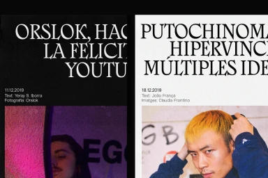
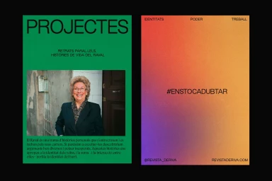
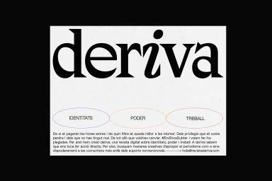
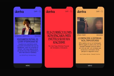
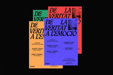
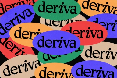
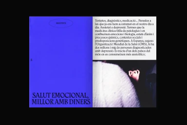
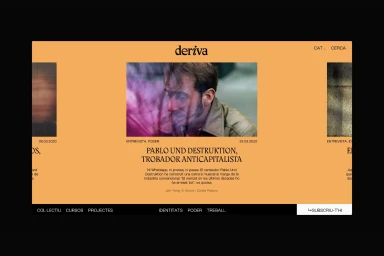
The brand identity for Deriva is a masterclass in modern editorial design, effectively bridging the gap between digital media and cultural commentary. Crafted with meticulous attention to detail by the team at Réplica Studio, the project leans into a bold, minimalist aesthetic that prioritizes high-contrast visuals and striking typography. By utilizing a sophisticated blend of editorial flair and functional UI illustration, the identity establishes a distinct visual language that feels both raw and highly professional. The execution relies on a diverse toolkit, incorporating elements of analogue film grain and intentional lighting to create authentic, textured imagery that stands out against clean, structured layouts. Development by Feijoo-Montenegro ensures that this visual rigour translates seamlessly into a responsive web interface, where vibrant color blocks and serif typography drive reader engagement. Whether manifested in the series of promotional posters for cultural criticism courses or through dynamic mobile interface layouts, the identity remains cohesive and graphically driven. The use of overlapping geometric forms and bold, layered compositions injects a sense of artistic movement, successfully positioning Deriva as a platform that values intellectual depth as much as contemporary design. This identity project exemplifies how structured, clean layouts and a thoughtful typographic hierarchy can define the presence of a modern media publication in an increasingly crowded digital landscape.
Horizontal, Graphic
Typography

