
COPS': Brand Identity

Brand
Date
Jun 2022
Description
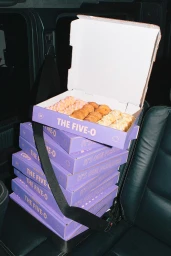
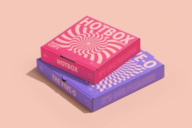
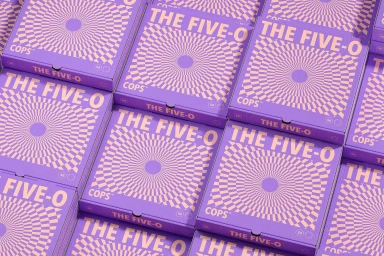
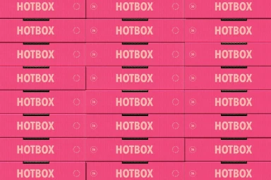
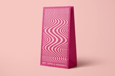
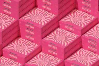
The brand identity for COPS, developed by Common Studios, centres on a high-contrast visual language applied across takeaway packaging for their food and beverage offerings. The project utilises a bold, monochromatic colour palette, incorporating hypnotic optical patterns and clean geometric typography to create a cohesive retail aesthetic. The execution relies on precise graphic design and 3D render / CGI techniques, featuring a mix of vibrant pink, purple, and peach tones. Packaging assets, ranging from coffee cups and paper bags to pizza-style pastry boxes, are presented with a minimalist and editorial focus, highlighting the brand's sharp visual system.
Style
Clean, Horizontal, Commercial, Graphic
Techniques
3D render / CGI
Industries
Color
Hot Pink
Context
E-commerce / Product
Associated creatives

5000+ creatives to discover
Sign up to gain access to the entire directory. It’s free.
Visie is a curated library of creative professionals.