Christie's: Brand Identity
May 2020
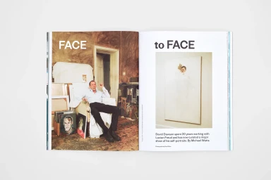
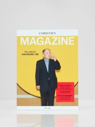
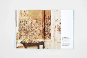
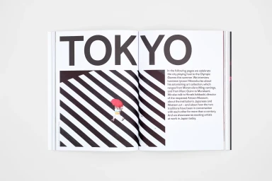
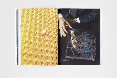
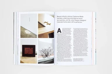
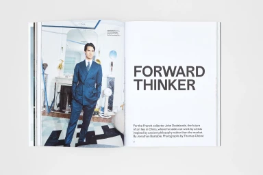
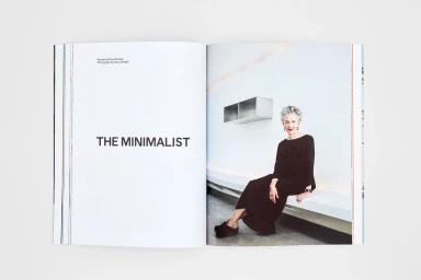
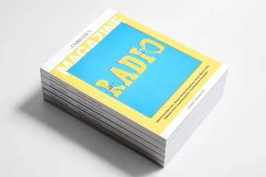
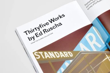
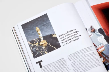
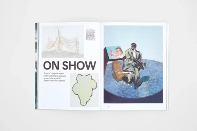
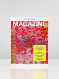
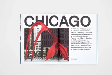
Christie's ongoing brand identity project serves as a masterclass in editorial design within the digital media and publishing space. By seamlessly blending high-end commercial sensibilities with the tactile nature of print, the publication transforms auction house catalogs into sophisticated cultural artifacts. Under the expert graphic design direction of B.A.M., each spread channels a distinct editorial minimalism, utilizing expansive white space and bold, sans-serif typography to anchor complex narratives. The project leans into high-key lighting and professional live-action technique to document everything from the aged, lived-in character of artist studios to the crisp, modern aesthetic of global art collectors. Whether framing a portrait of an iconic figure or highlighting the sharp, high-contrast geometry of urban architecture, the layout remains consistently refined and deliberate. The execution effectively balances surrealist artistic flourishes—such as mirrored glass and unexpected color palettes—with the structured clarity required for high-end exhibition documentation. This approach to brand identity goes beyond simple communication, establishing a visual language that celebrates contemporary art through carefully curated photography and strategic page composition. By prioritizing clean lines and sophisticated, tactile material quality, the work elevates the Christie's brand, ensuring that every magazine edition feels as collectible as the fine art it represents, ultimately bridging the gap between historical legacy and contemporary visual trends.
Editorial, Horizontal, Clean
Typography
White Seamless
Editorial