
Canevas: Brand Identity
Jan 2023
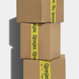
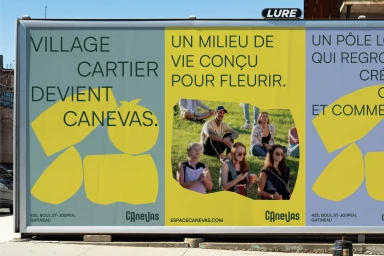
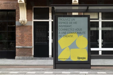
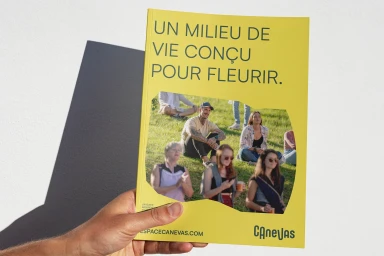
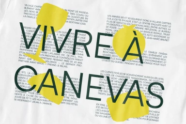
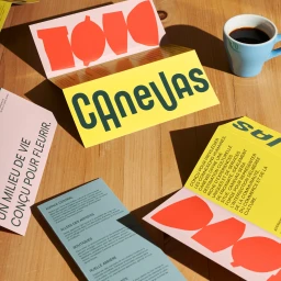
Canevas introduces a comprehensive brand identity system developed by Clairoux Studio, focusing on a tactile and typographic approach to collateral design. The project spans a variety of touchpoints, from custom packaging solutions to outdoor media placements and print brochures. The visual language leans into a minimalist aesthetic, utilizing a bold color palette of muted green, yellow, and blue. Each asset incorporates strong sans-serif typography and irregular geometric shapes, which recur across the brochure layouts and large-scale billboard executions. By layering graphic elements over subtle textures, the identity emphasises a clean presentation. The use of organic-shaped cut-outs in print materials and high-contrast composition techniques creates a cohesive look across all brand assets.
Commercial, Clean
